Every payment feels like a step forward

Till Payments

2023
Live Site
  • Brand identity
  • Strategy
  • Digital product
  • Website
  • Campaign
  • Packaging
  • Motion
  • Editorial
  • Spatial & retail
  • Service design
Till had grown from spunky startup to sophisticated payments platform, but the brand experience hadn't kept pace. Customers met one brand on the marketing site and a different one inside the product.

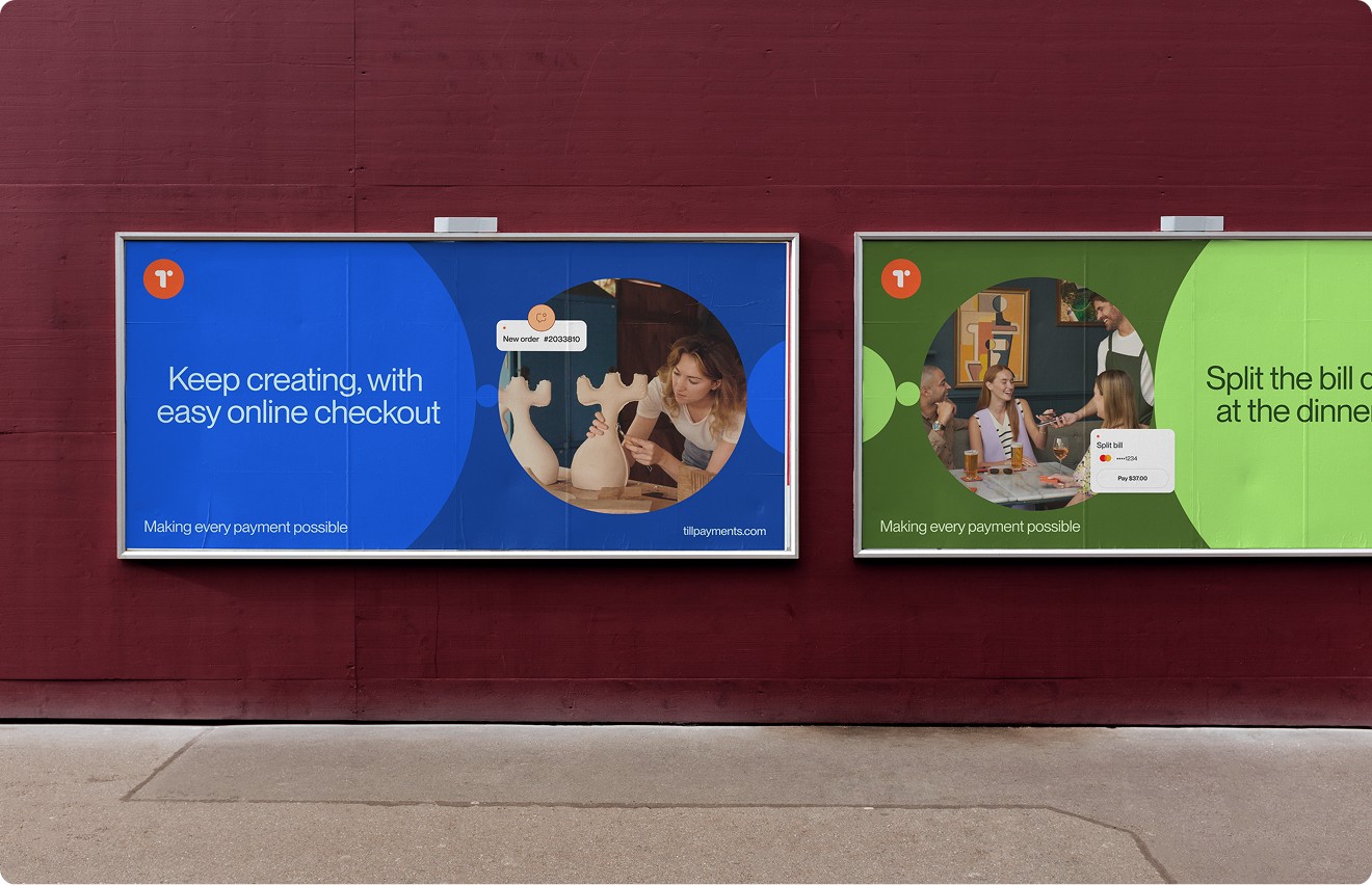
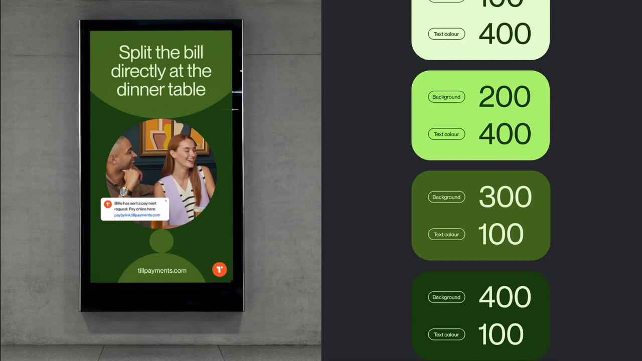
Billboard
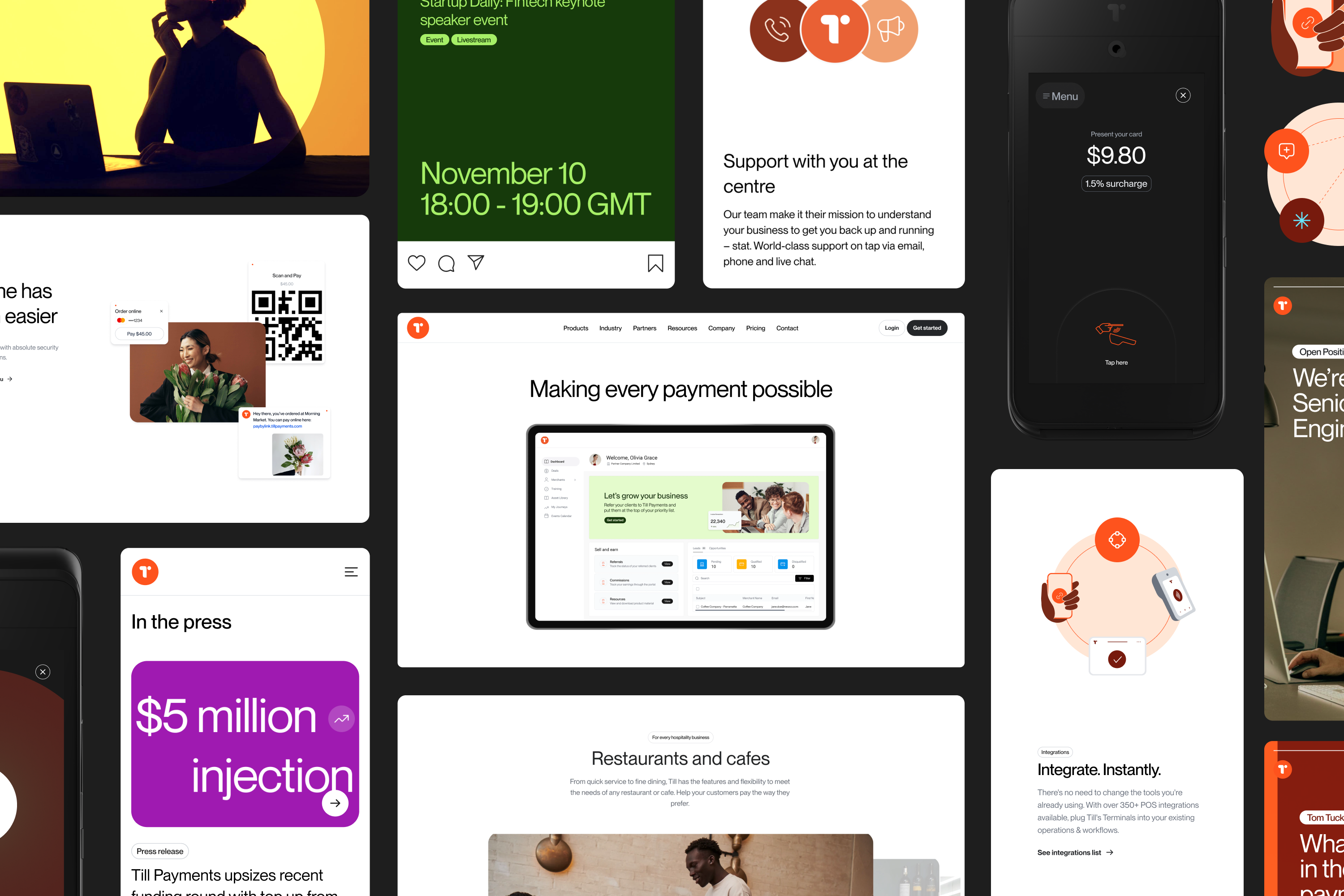
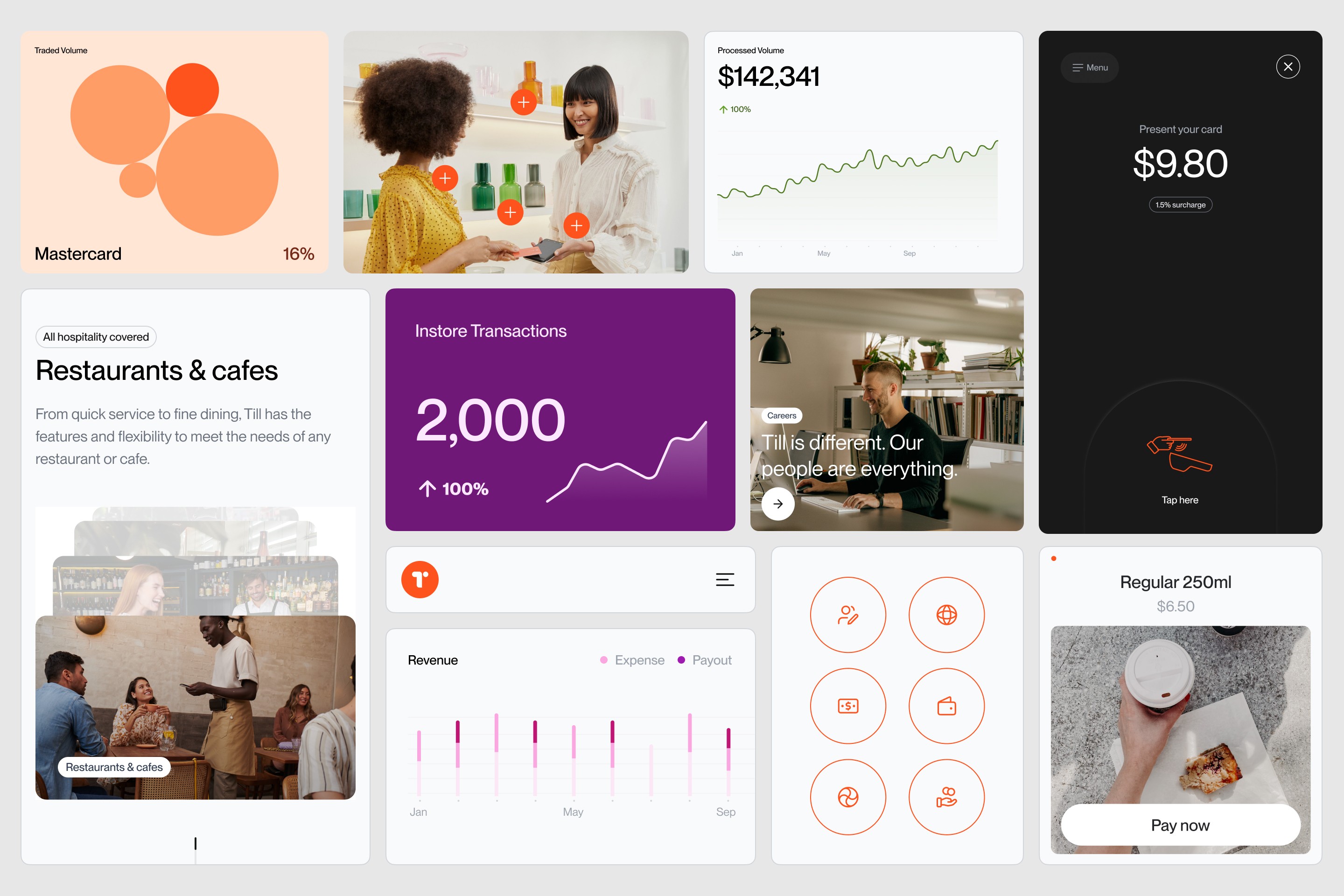
Grid of marketing assets, from press cards and event posts to terminal UI and Till website pages
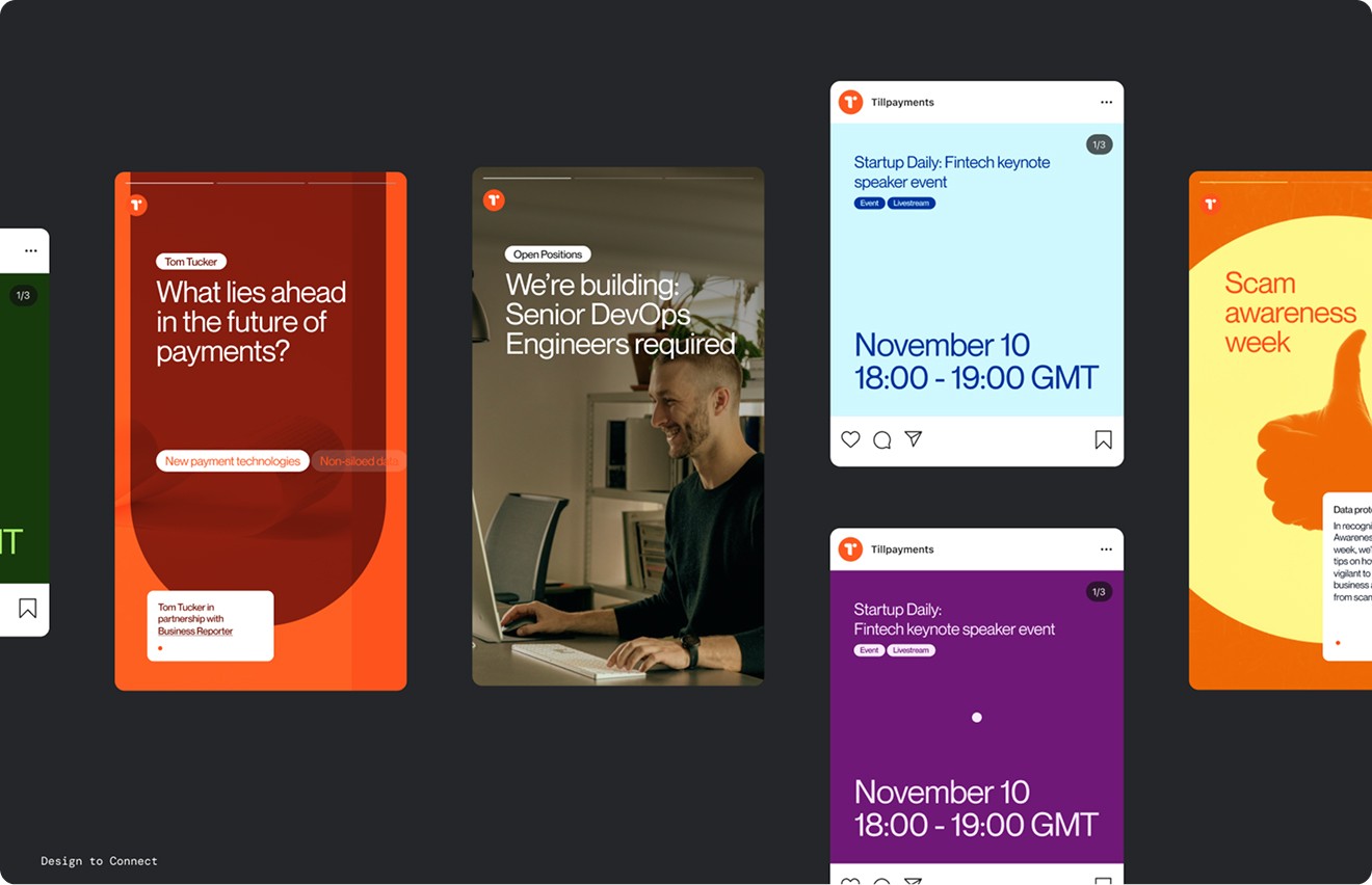
Recruitment and event social posts in red, purple and yellow arranged on a dark canvas
Two payment terminals angled on white, one dark and one light, both showing the clock screen
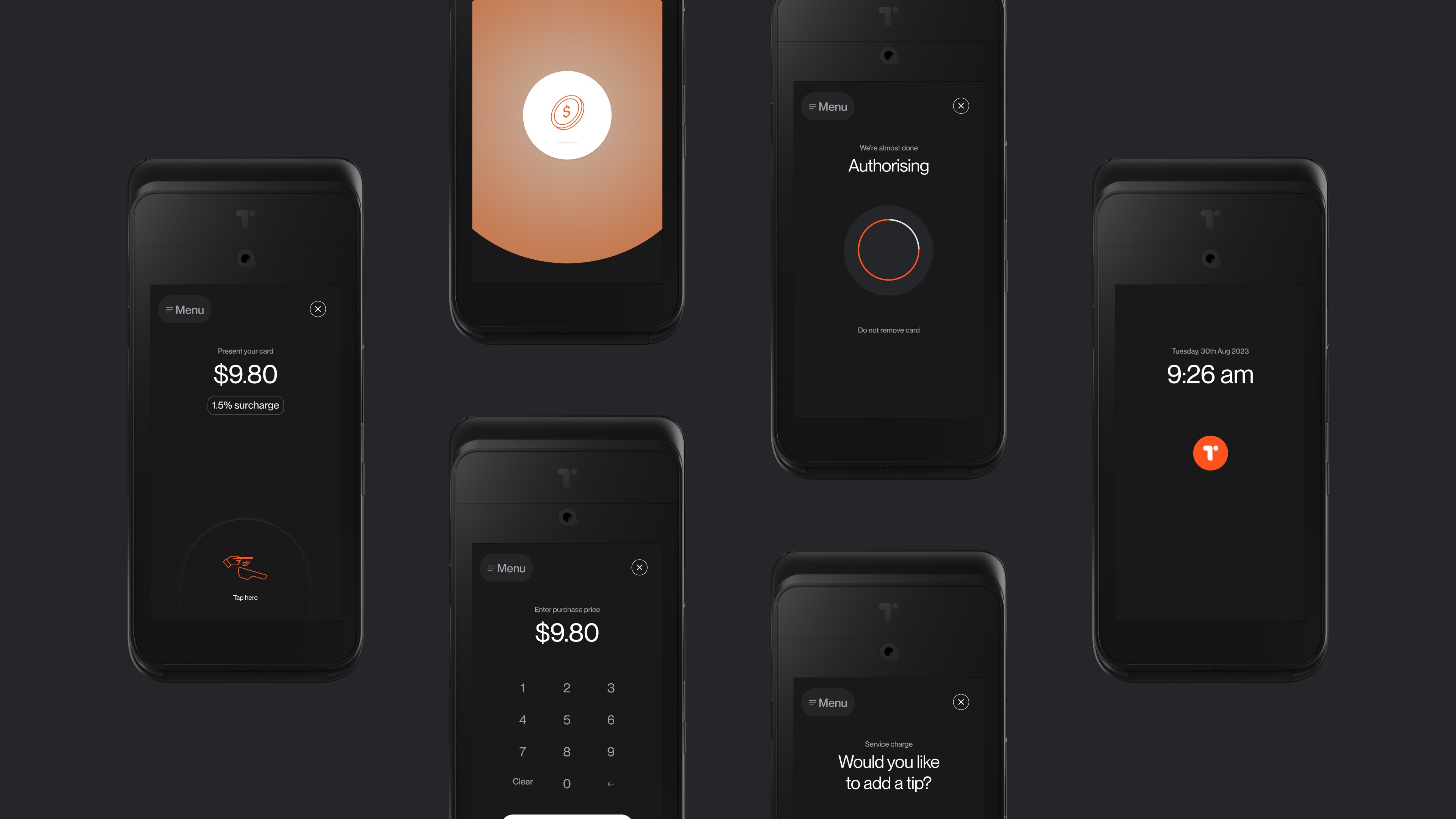
Six dark terminal screens: amount entry, authorising, tip prompt and idle clock display
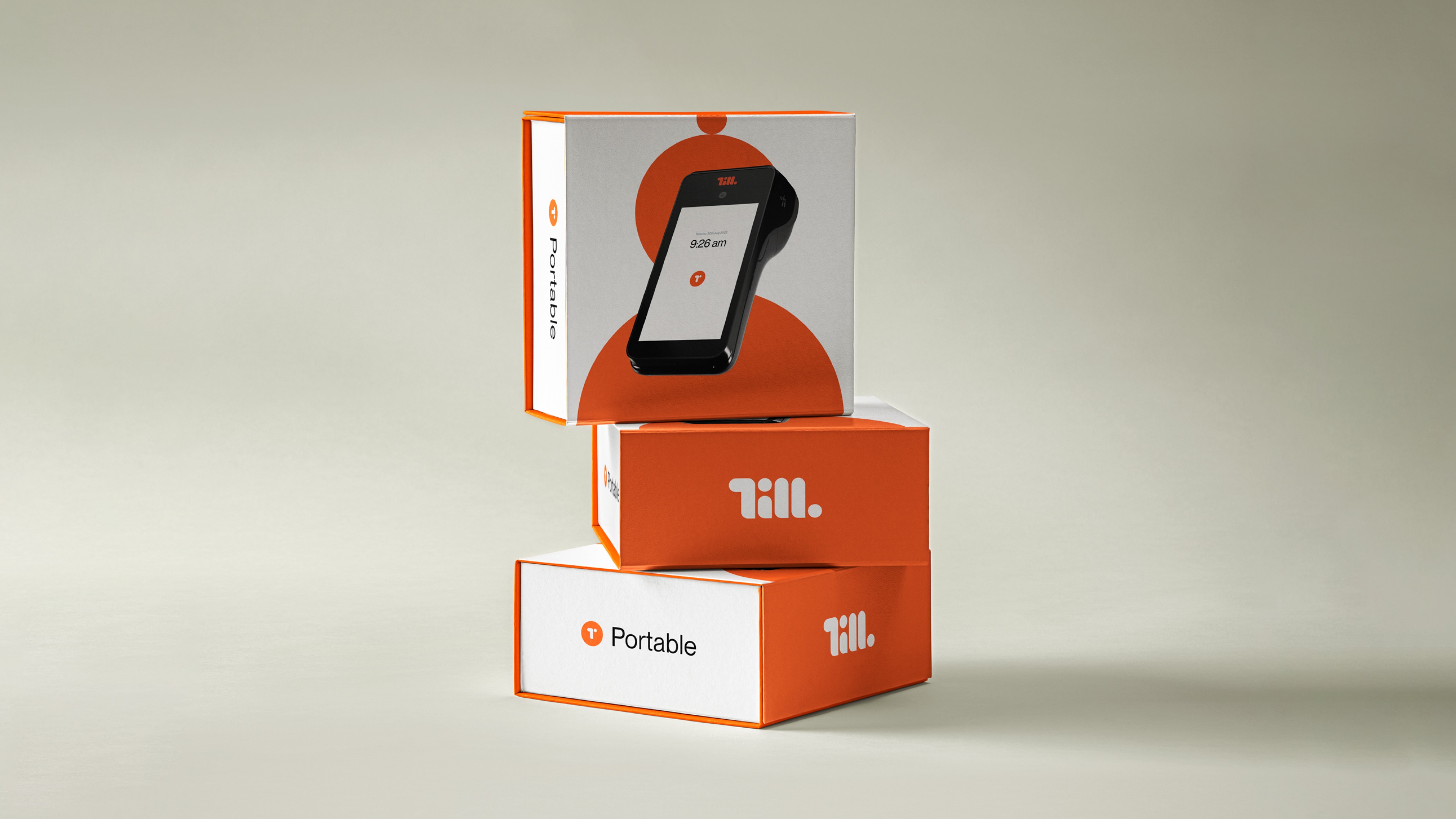
Orange Till Portable packaging boxes stacked, wordmark front and terminal shown through the window
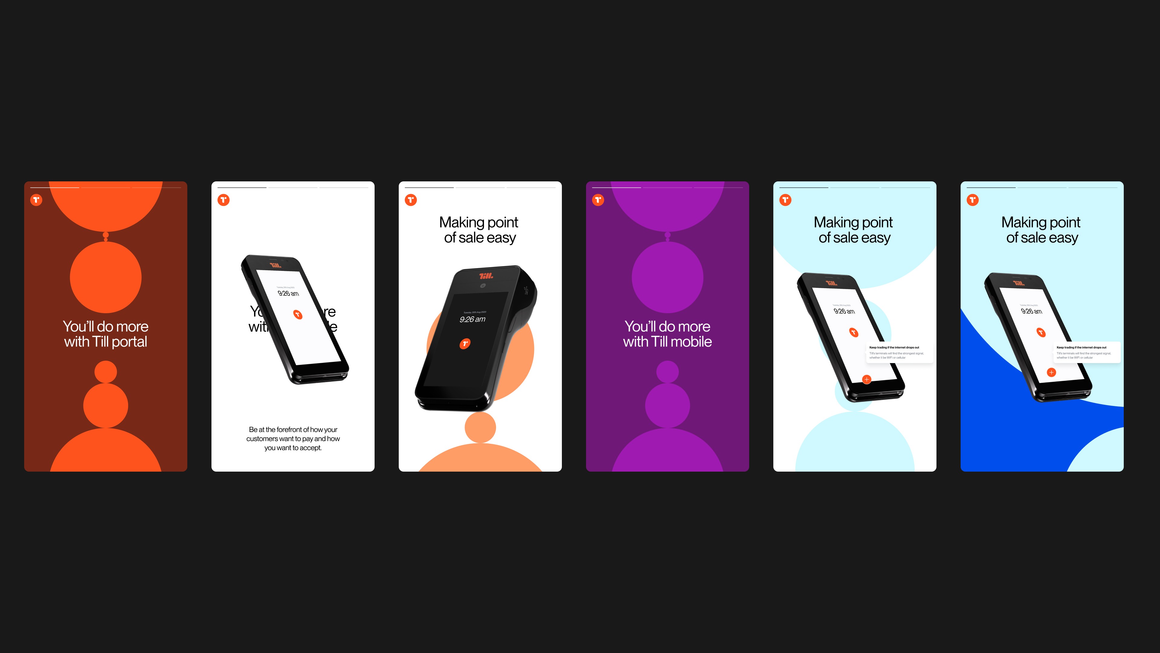
Onboarding app screens for portal and mobile, circle motifs in rust, purple, blue and white
Till UI kit: data charts, stat cards, icon set and lifestyle imagery in coral and purple
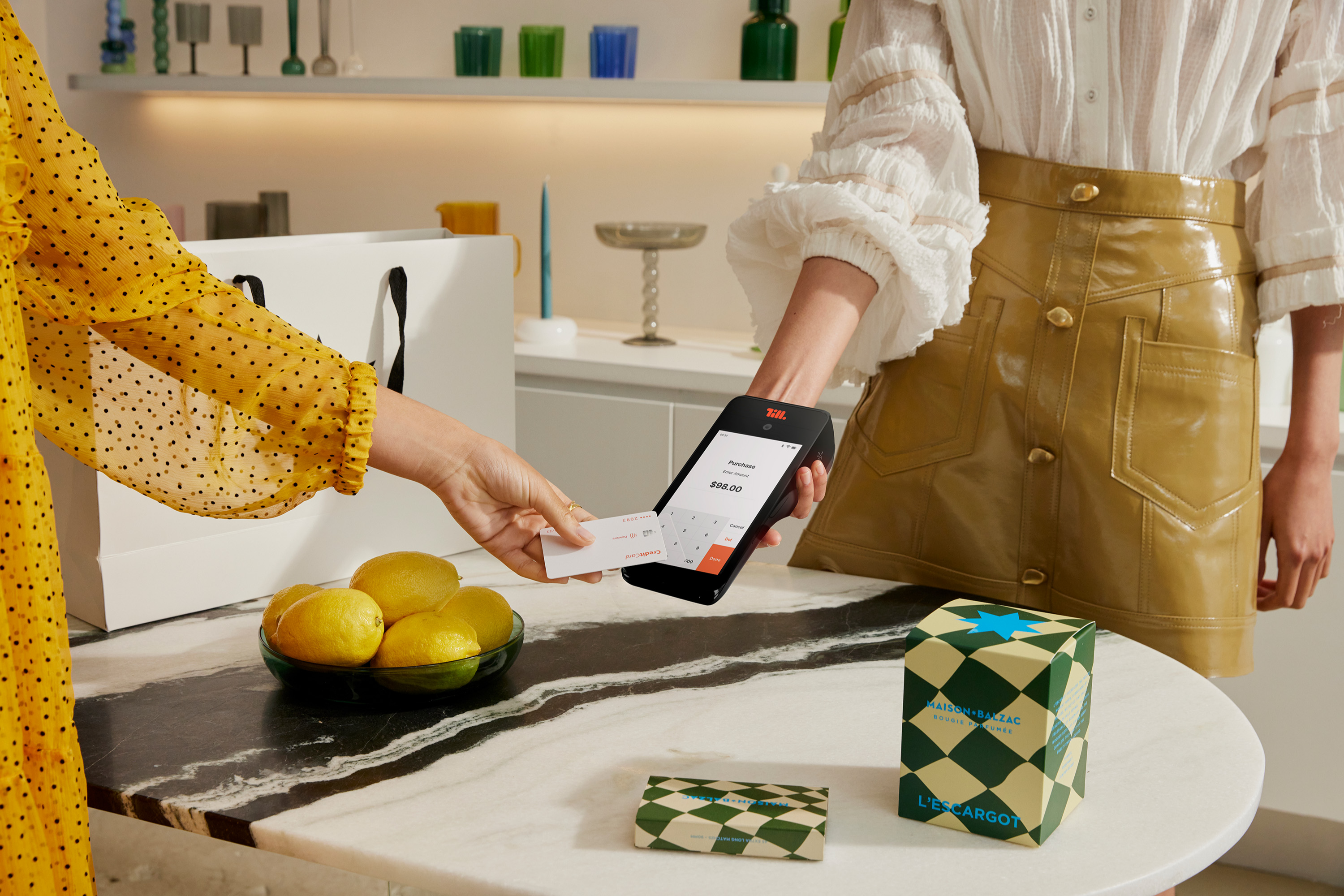
Customer tapping a card on a payment terminal at a marble counter with lemons and packaging
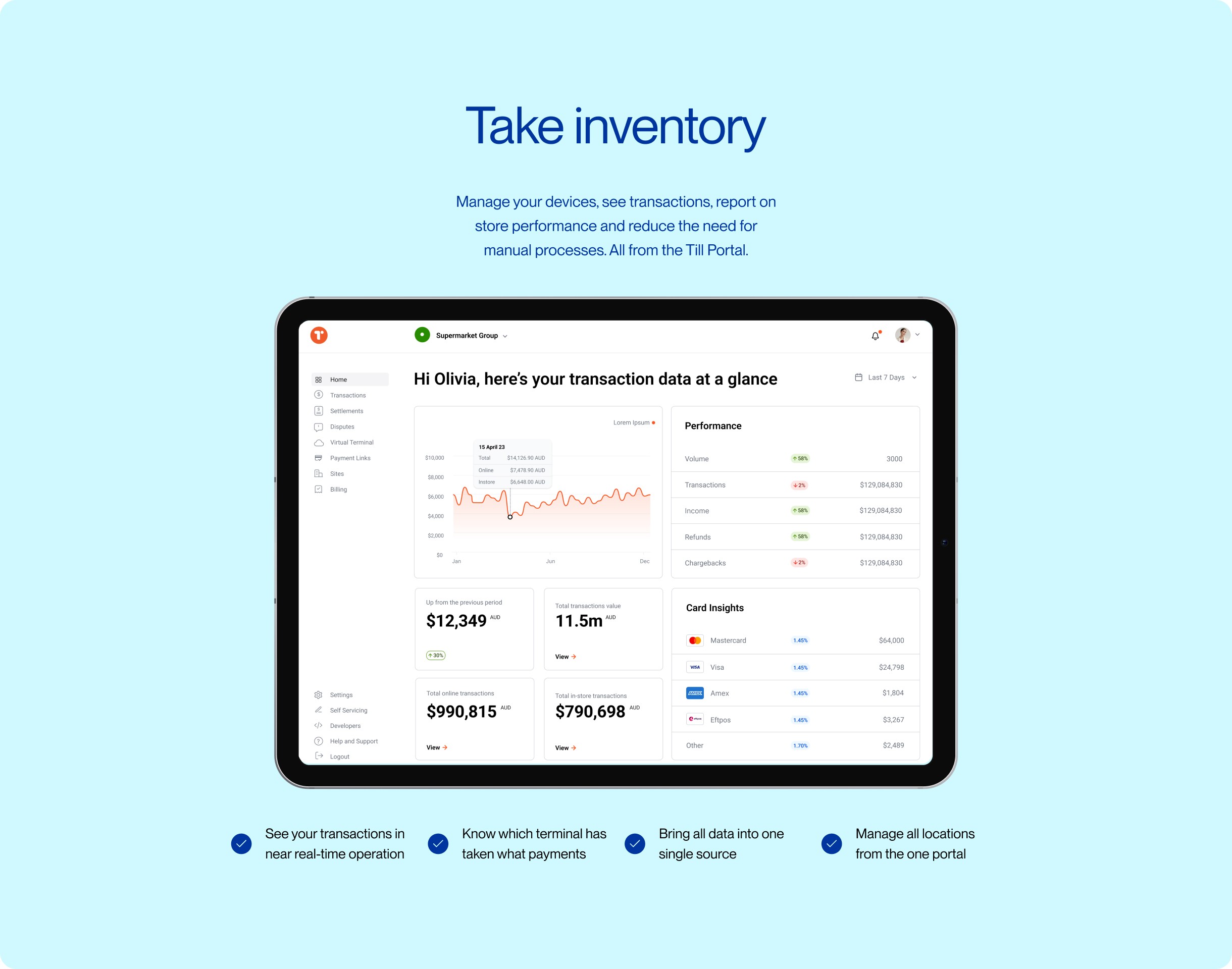
Till Portal dashboard on a tablet, pale blue Take inventory page with transaction charts
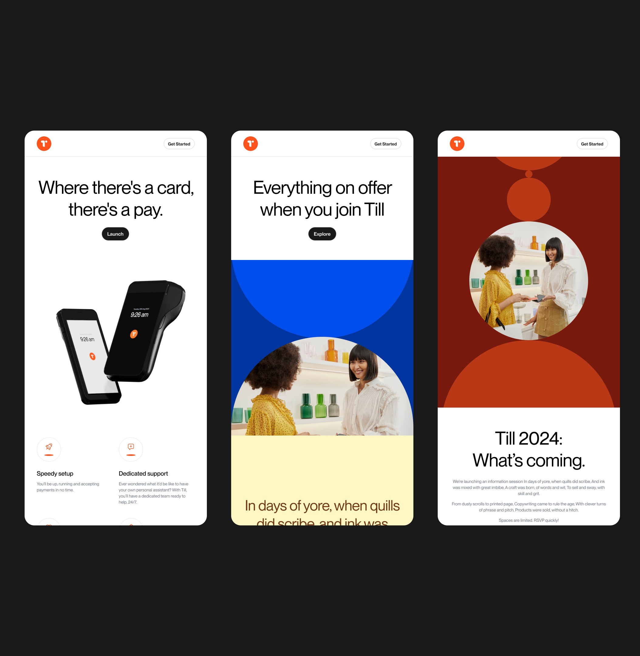
Five responsive web screens using bold circular colour blocks in blue, ochre and lilac

More work

Get in touch

hello@re.design
©2026
Level 20, 25 Martin Place Sydney, 2000
The Commons, 10-20 Gwynne St, Cremorne VIC 3121