Two iconic teams, behaving as equals

New Zealand Rugby

2025
  • Brand identity
  • Strategy
  • Digital product
  • Website
  • Campaign
  • Packaging
  • Motion
  • Editorial
  • Spatial & retail
  • Service design
New Zealand Rugby was facing a critical inflection point. Women's rugby was experiencing astronomical growth, but the All Blacks and Black Ferns were operating under separate brand systems. The sport's future depended on making both teams behave with equal authority, investment and cultural weight.

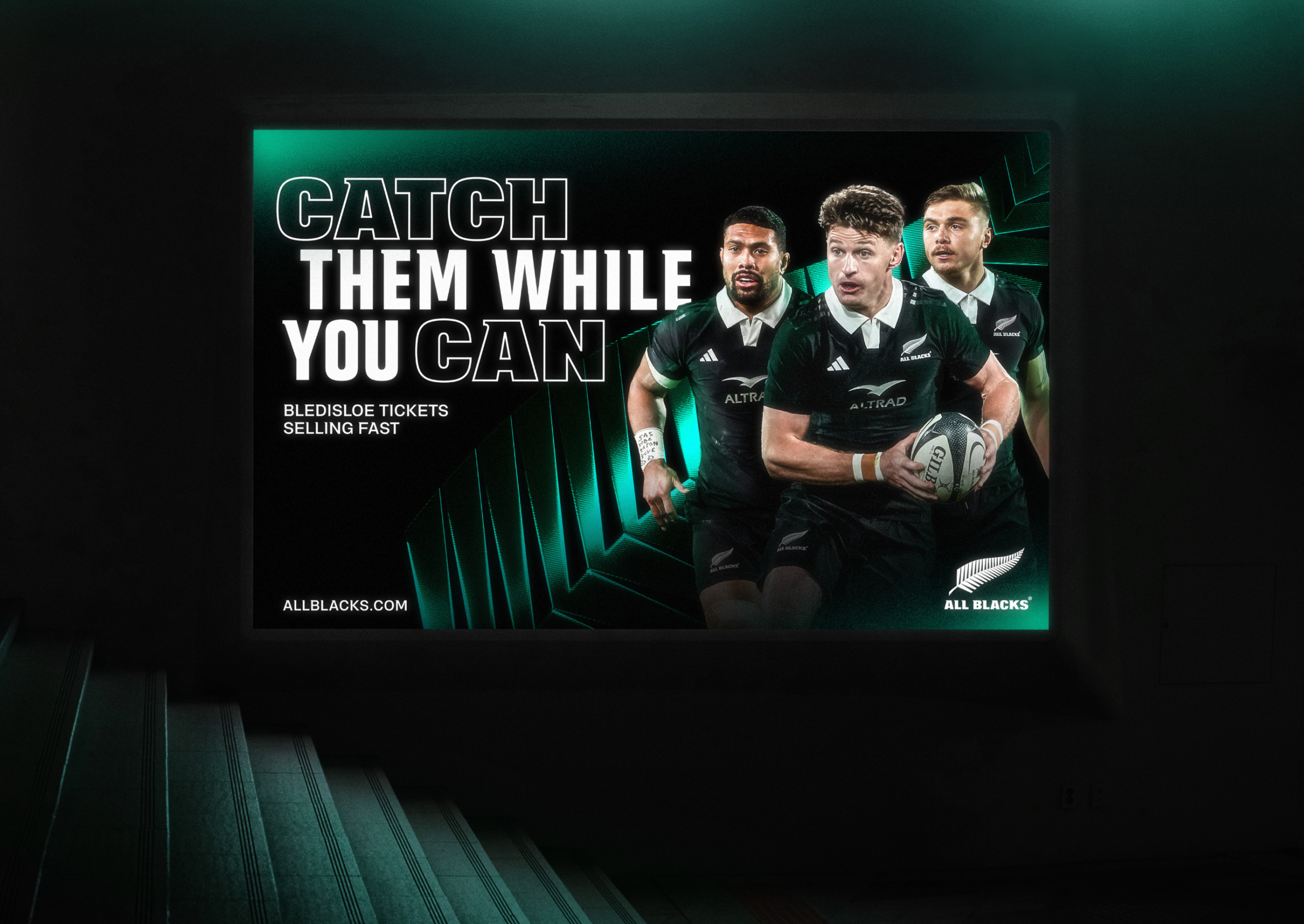
Illuminated billboard reading "Catch them while you can", Bledisloe ticket ad in green
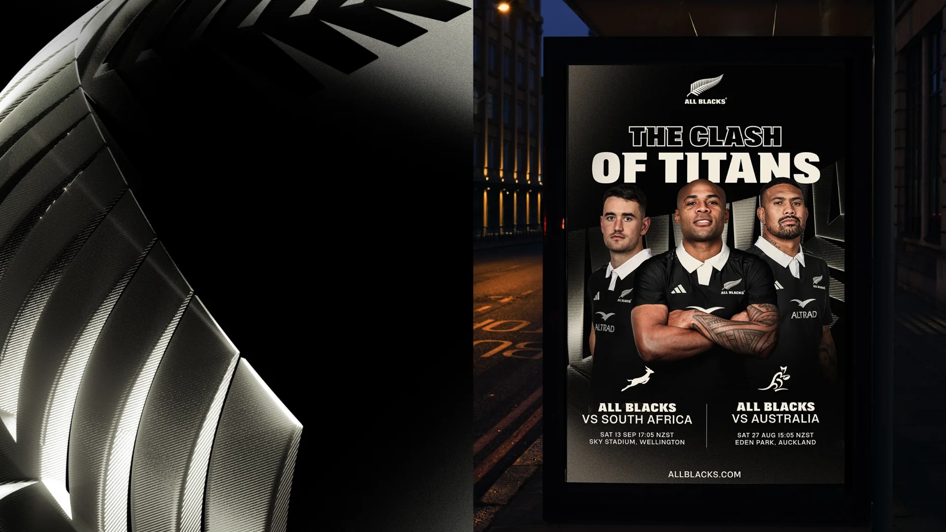
Silver fern detail beside a street-side digital poster, "The Clash of Titans" fixtures
Fern structure in emerald green, sweeping ridged blades used as a background graphic
Abstract close-up of the fern mark rendered as ridged, woven purple blades
All Blacks running onto the pitch beneath a purple "All Blacks vs South Africa" screen
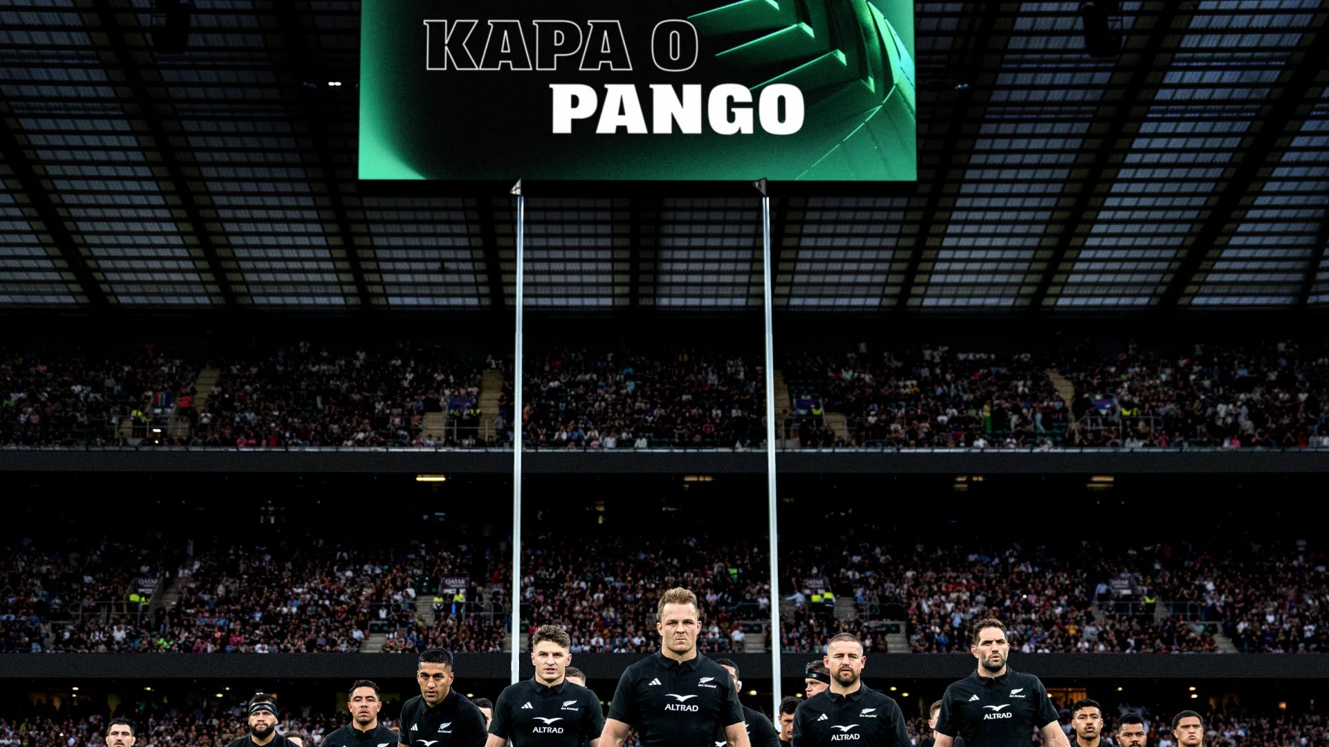
Stadium big screen reading "Kapa o Pango" above players lined up across the field
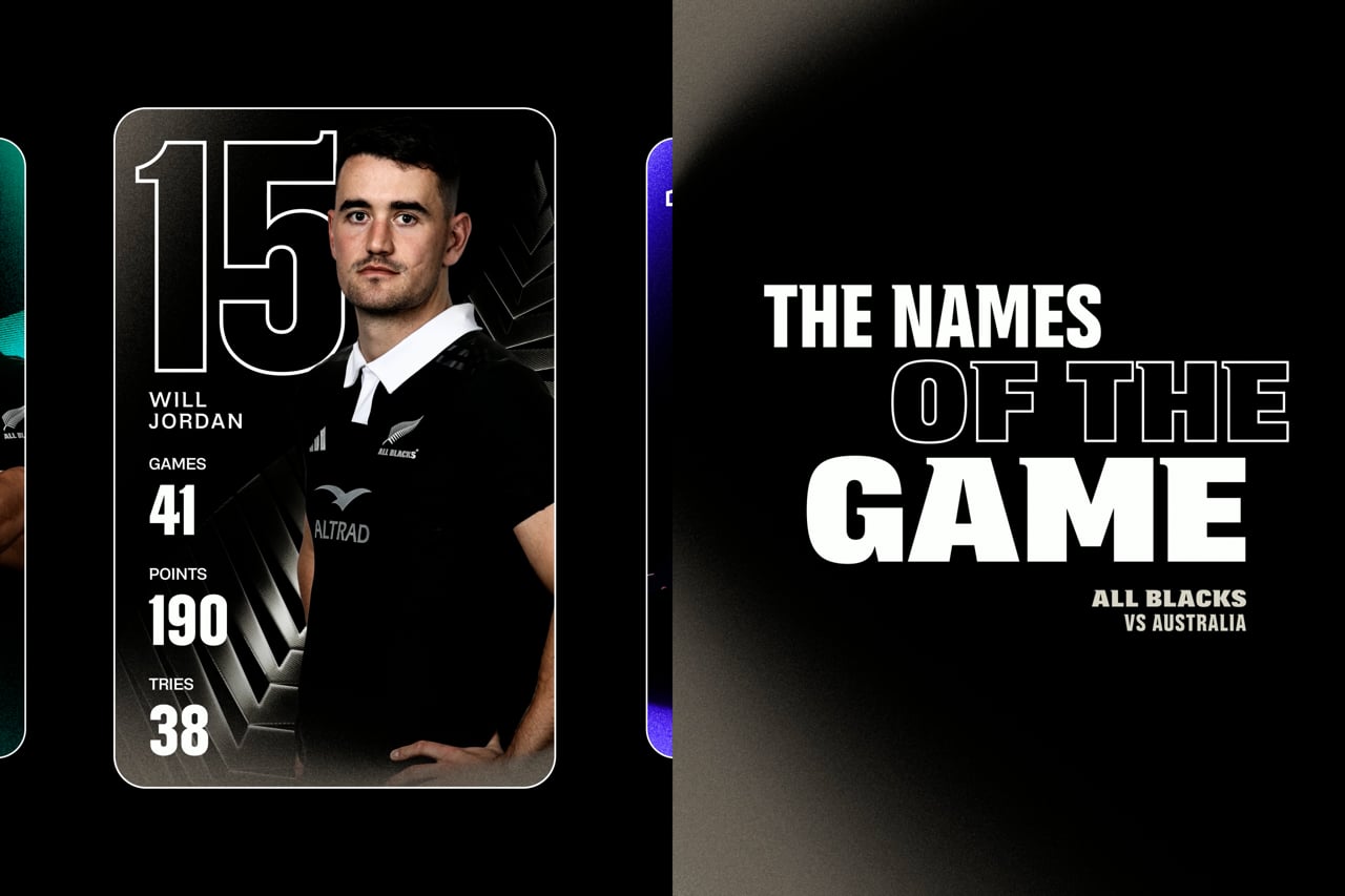
Close crop of the social feed system: score cards, line-ups and match-day posts
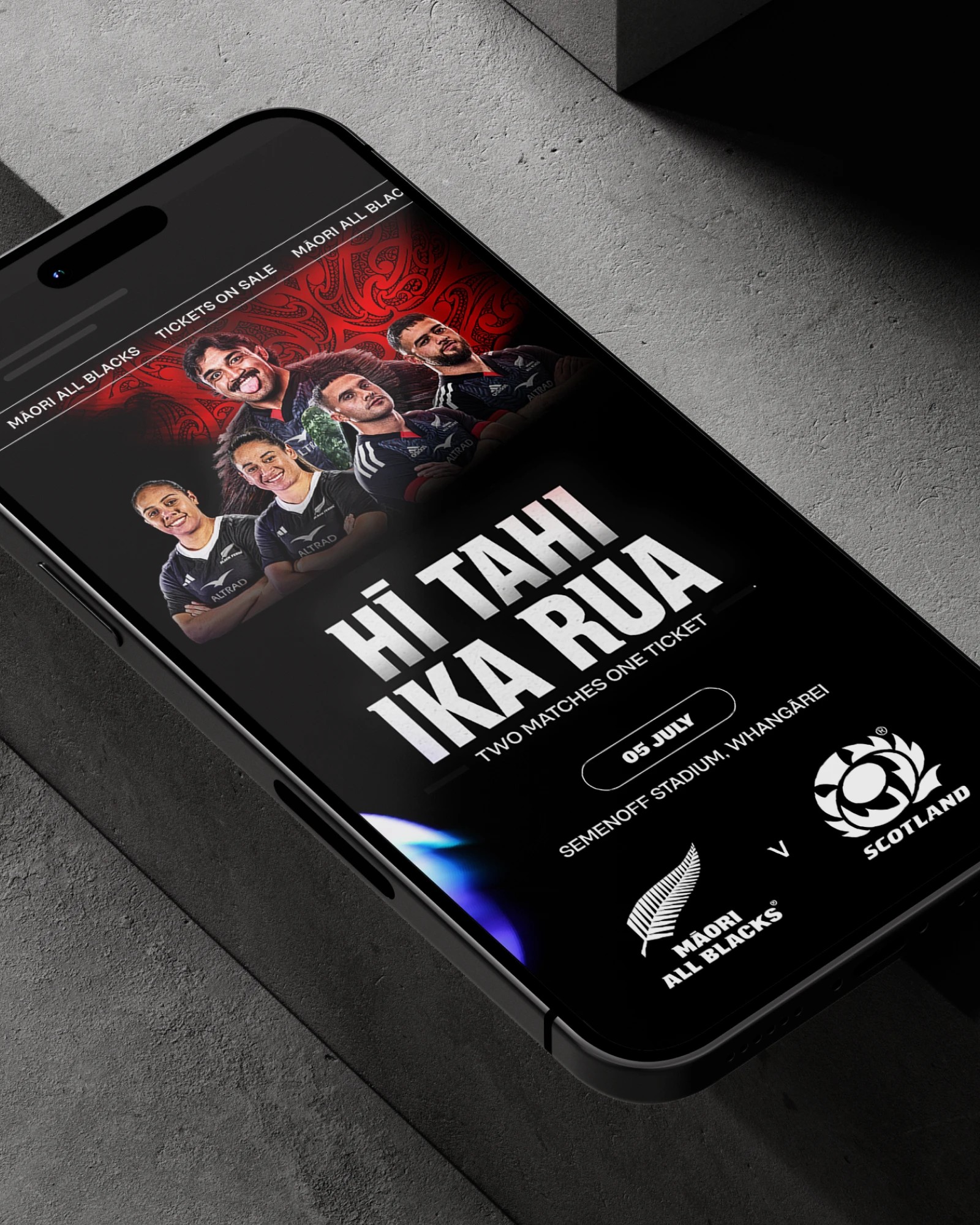
Phone screen with a Māori All Blacks v Scotland ticket page, headline "Hī tahi ika rua"
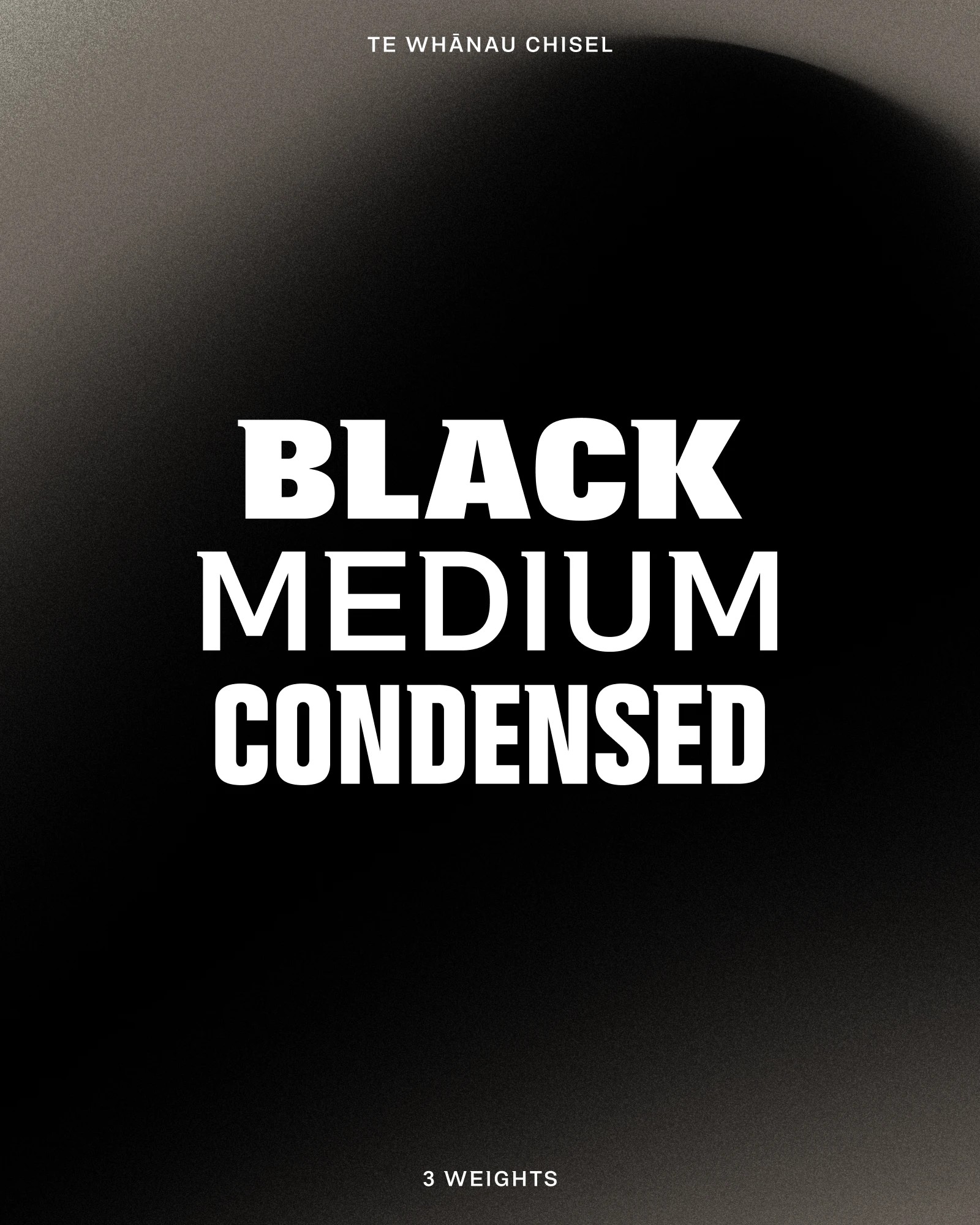
Te Whānau Chisel typeface specimen showing black, medium and condensed weights
Black Ferns player and a young fan in matching jerseys, purple fern graphic overlaid
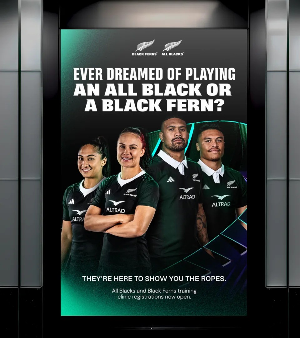
Vertical screen ad in a lift lobby, two Black Ferns and two All Blacks standing together
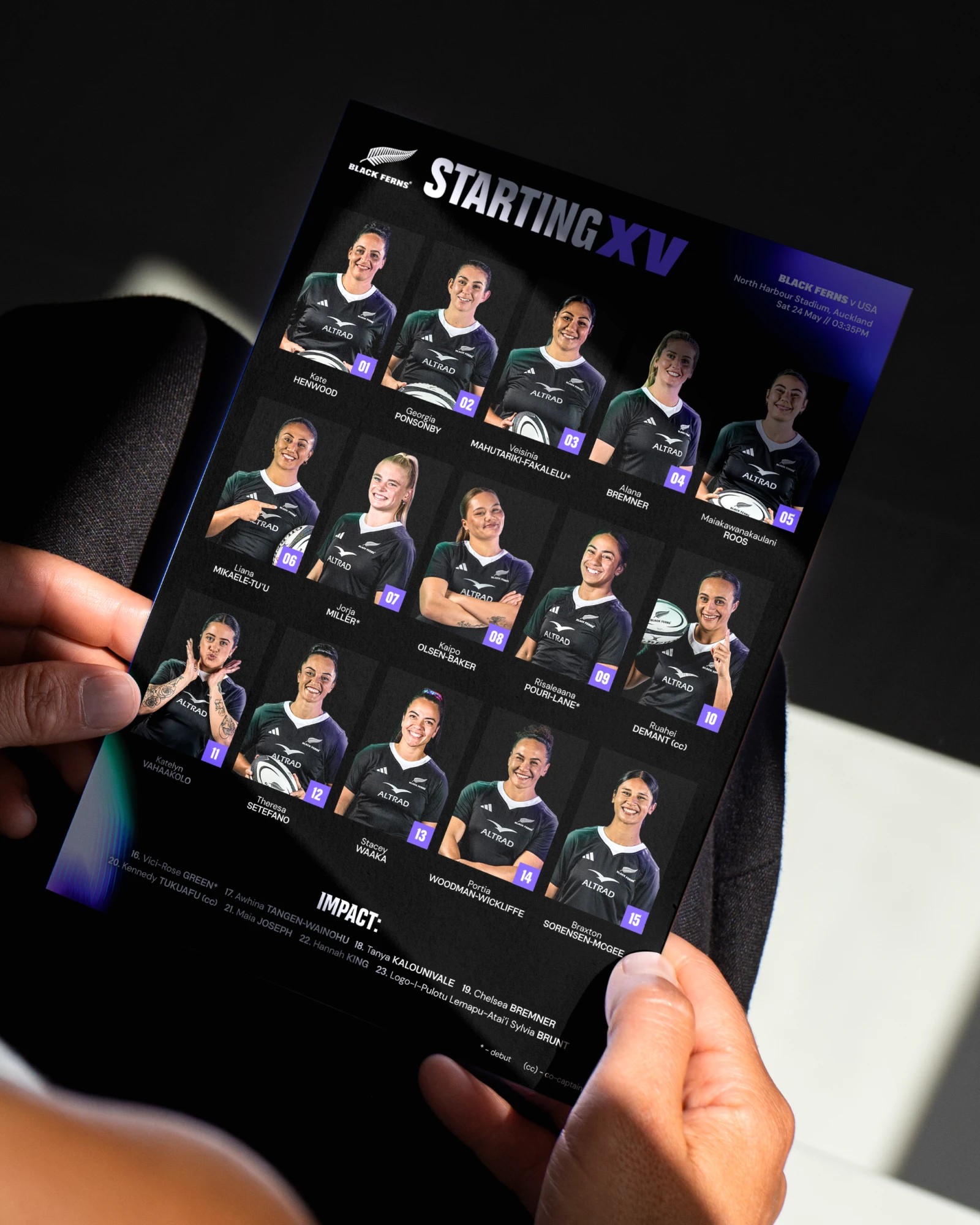
Hands holding a Black Ferns "Starting XV" team-sheet card of player portraits
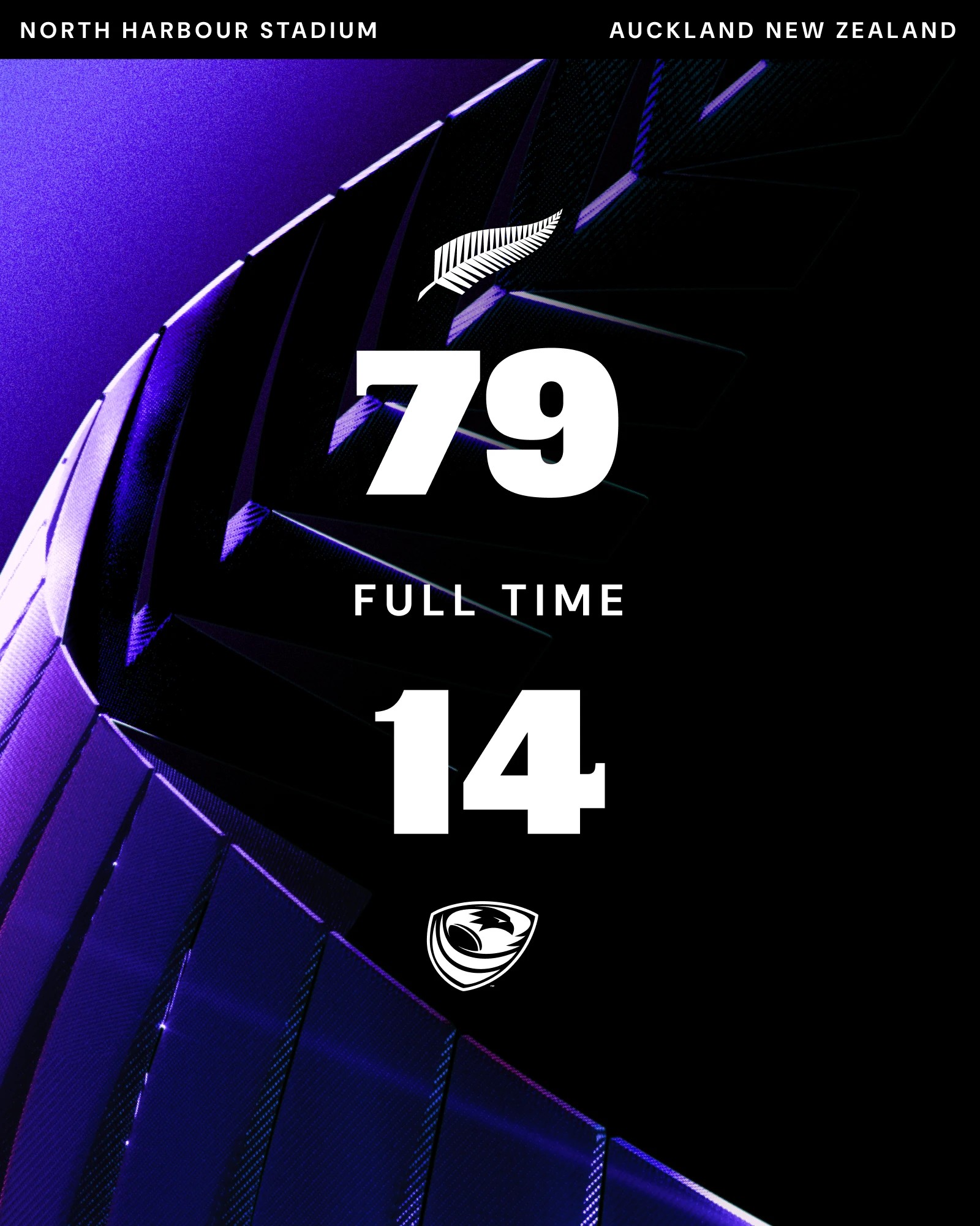
Full-time score graphic in violet, 79 to 14 at North Harbour Stadium, Auckland
Campaign poster set in outline and green type: "Some people say that rugby isn't everything"
Fans in the stands holding a "Do it like a Black Fern" banner with Māori pattern
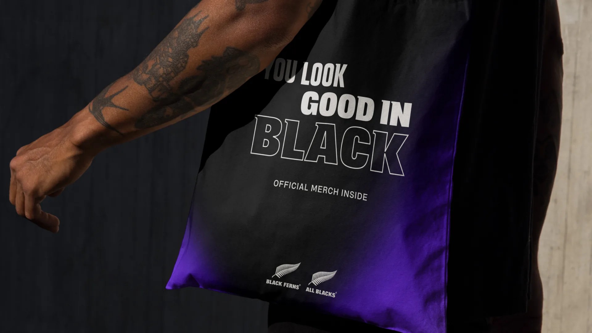
Merch tote in gradient black and purple, both teams' silver fern logos at its base

More work

Get in touch

hello@re.design
©2026
Level 20, 25 Martin Place Sydney, 2000
The Commons, 10-20 Gwynne St, Cremorne VIC 3121