Extending access to justice to more Australians

Maurice Blackburn

2022
  • Brand identity
  • Strategy
  • Digital product
  • Website
  • Campaign
  • Packaging
  • Motion
  • Editorial
  • Spatial & retail
  • Service design
As Australia's leading plaintiff firm, Maurice Blackburn helped win the 40-hour week and equal pay for women. Yet the legal system still behaves like it's built for insiders, leaving most people shut out at the moment they need it most. They needed a refreshed brand that showed Australians that Maurice Blackburn is different.
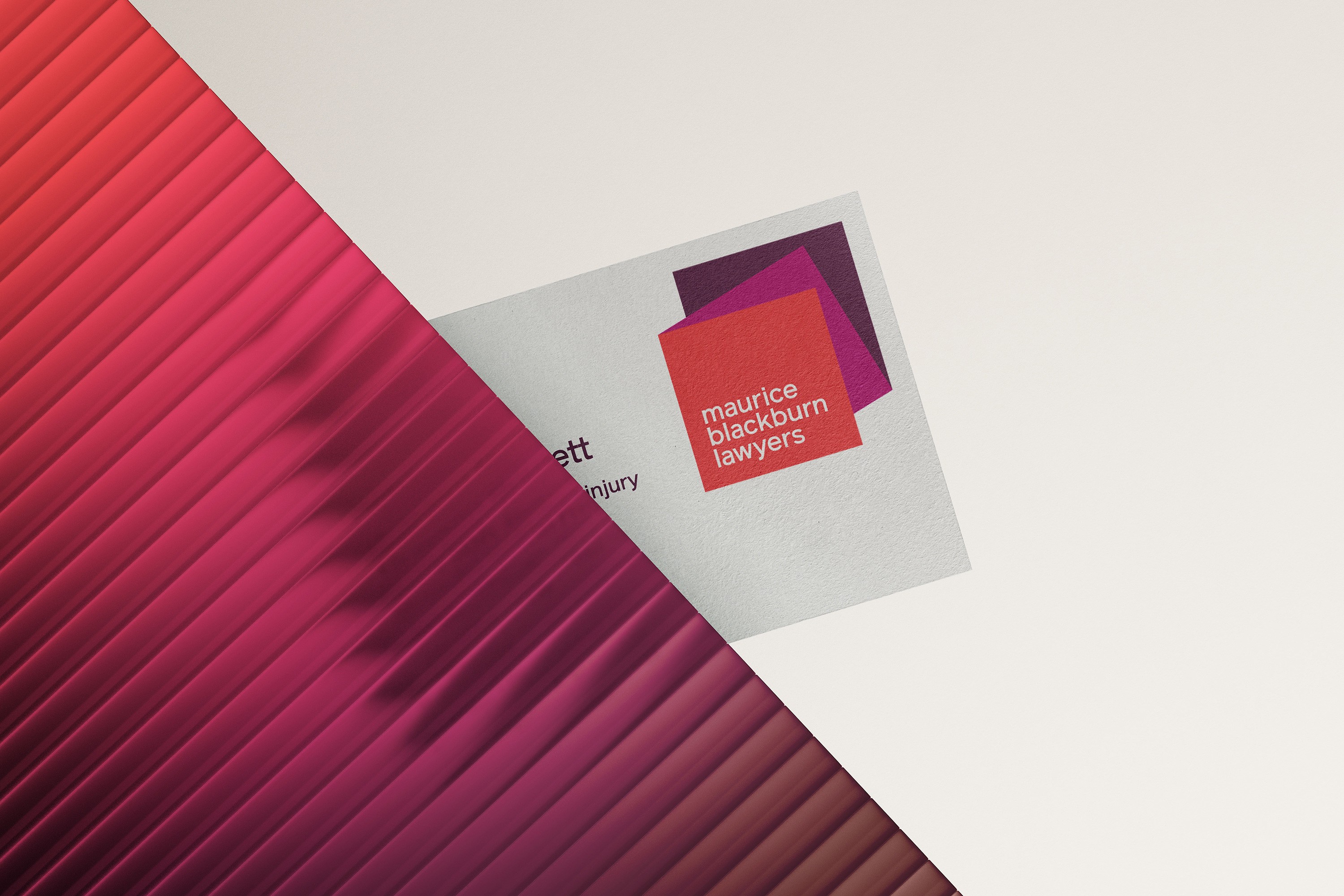
Close crop of the business card and its pleated red-to-plum gradient surface

Maurice Blackburn is Australia’s leading plaintiff law firm. They’ve played a role in some of the nation’s most important legal decisions, from the 40 hour working week to equal pay for women.

Maurice Blackburn has always believed the law should serve everyone, not just those who can afford it. Their refreshed brand and employer brand needed to express this by conveying the approachable, inclusive spirit of Maurice Blackburn, and highlighting what makes them stand out.
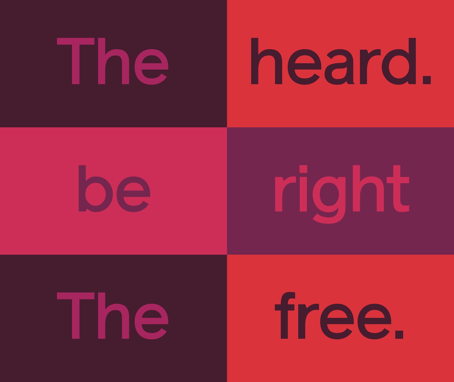
Typeface detail — 'The' in magenta filling a dark plum frame
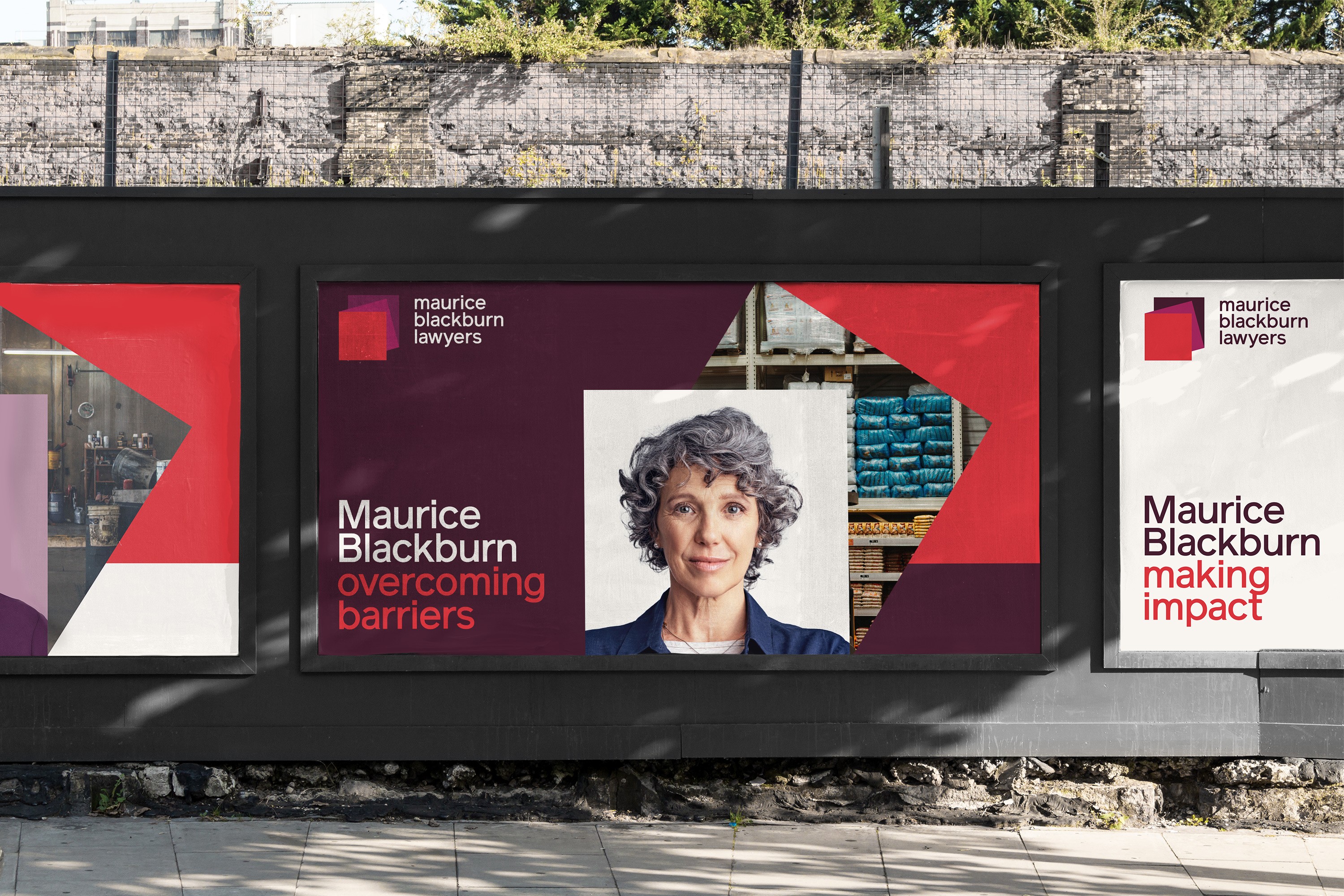
Street hoarding posters reading 'Maurice Blackburn overcoming barriers' and 'making impact', with portraits
Logo lockup of red, magenta and plum squares stacked, with the firm's name reversed out in white
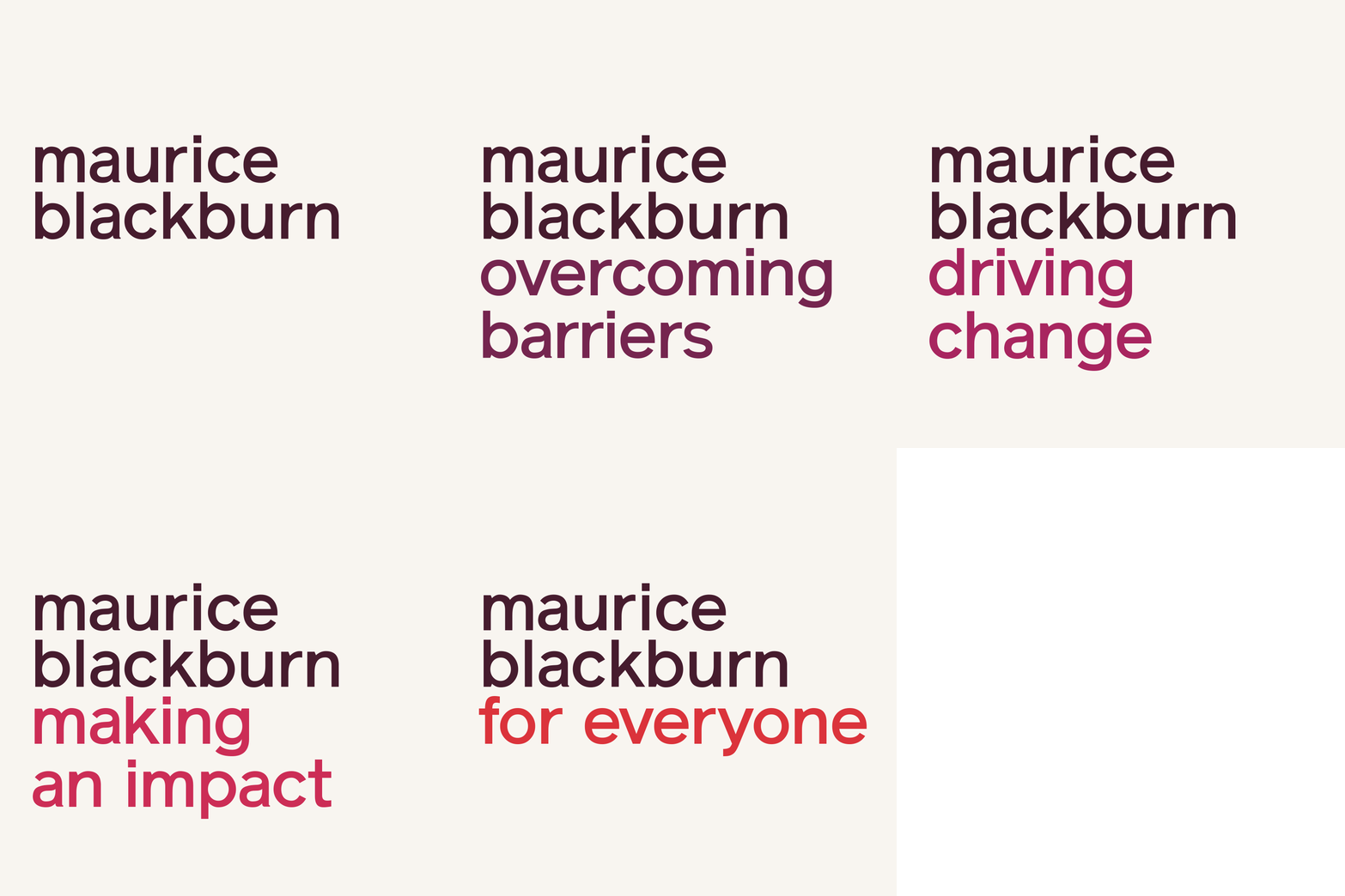
Lowercase wordmark 'maurice blackburn' in deep plum on off-white
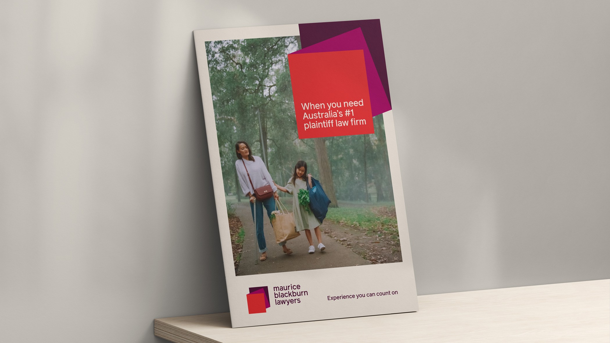
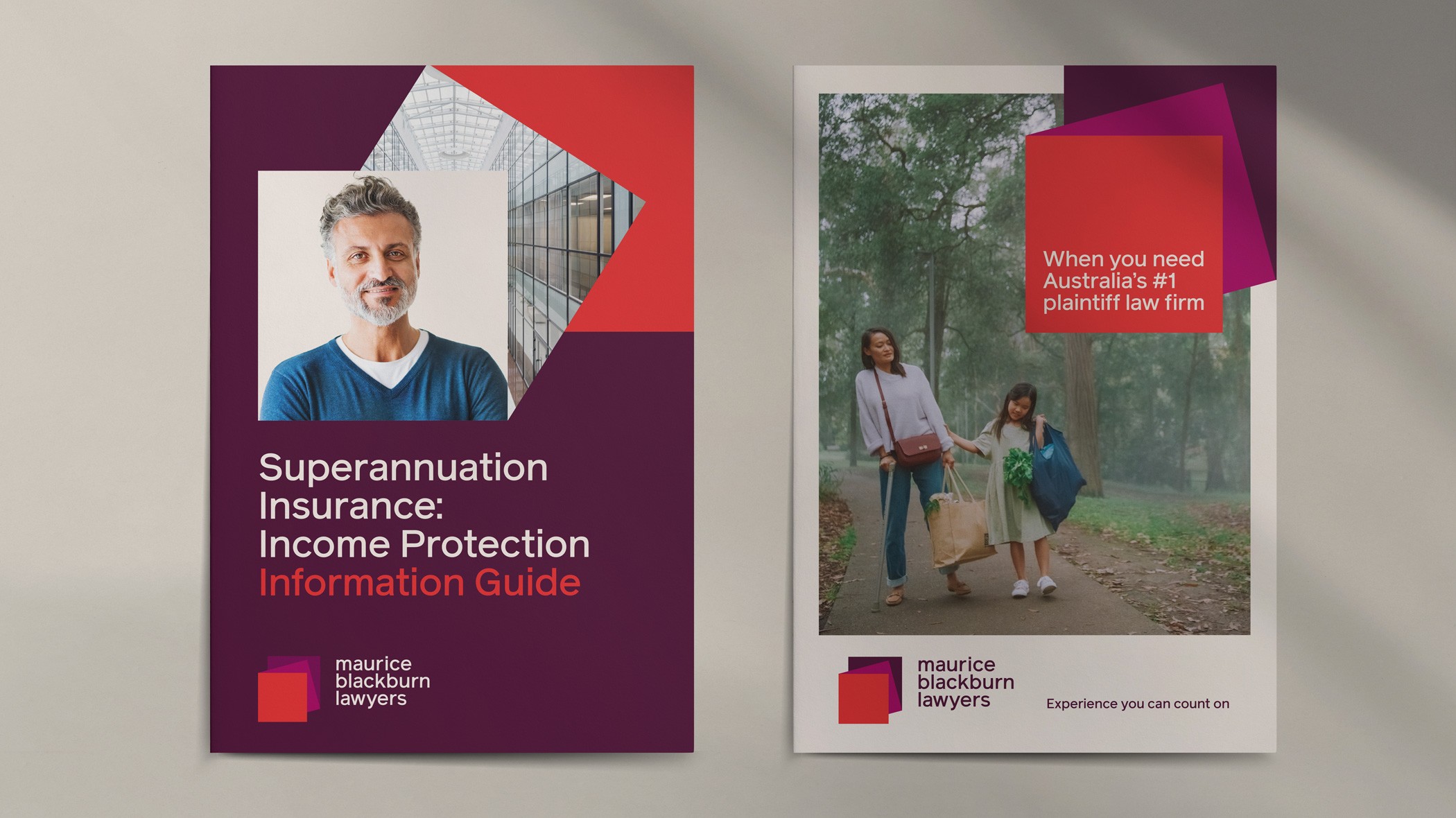
Brochure cover propped on a shelf, red headline panel over a photo of a woman and child walking
Two brochure covers layering red and plum squares over client photography
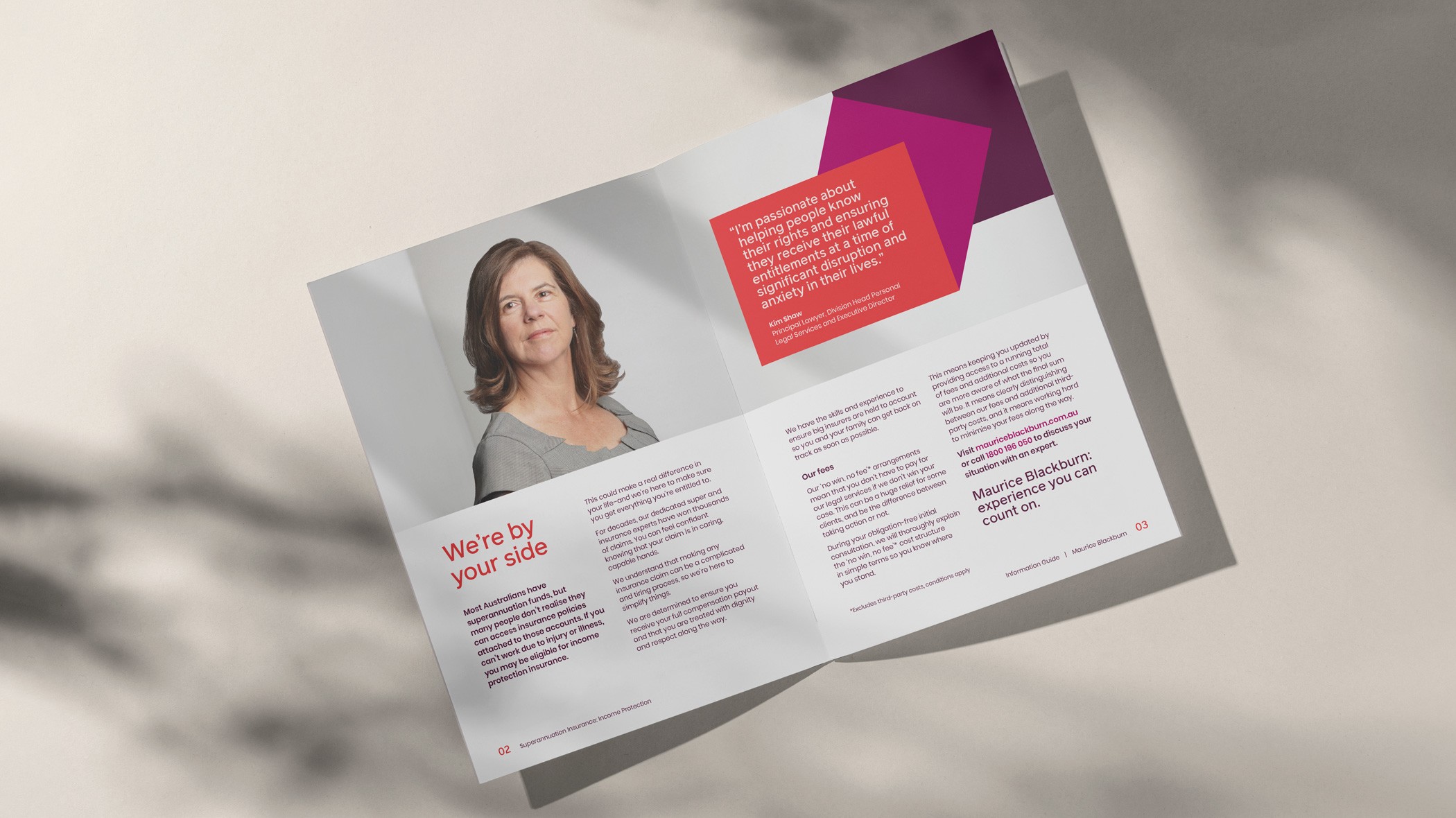
Maurice Blackburn brochure spread, 'We're by your side', with a portrait and red pull-quote panel
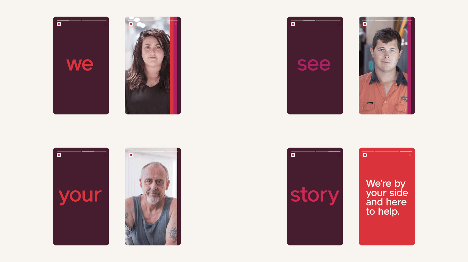
Two social story screens: a red 'we' on plum, and a portrait edged with a striped colour band
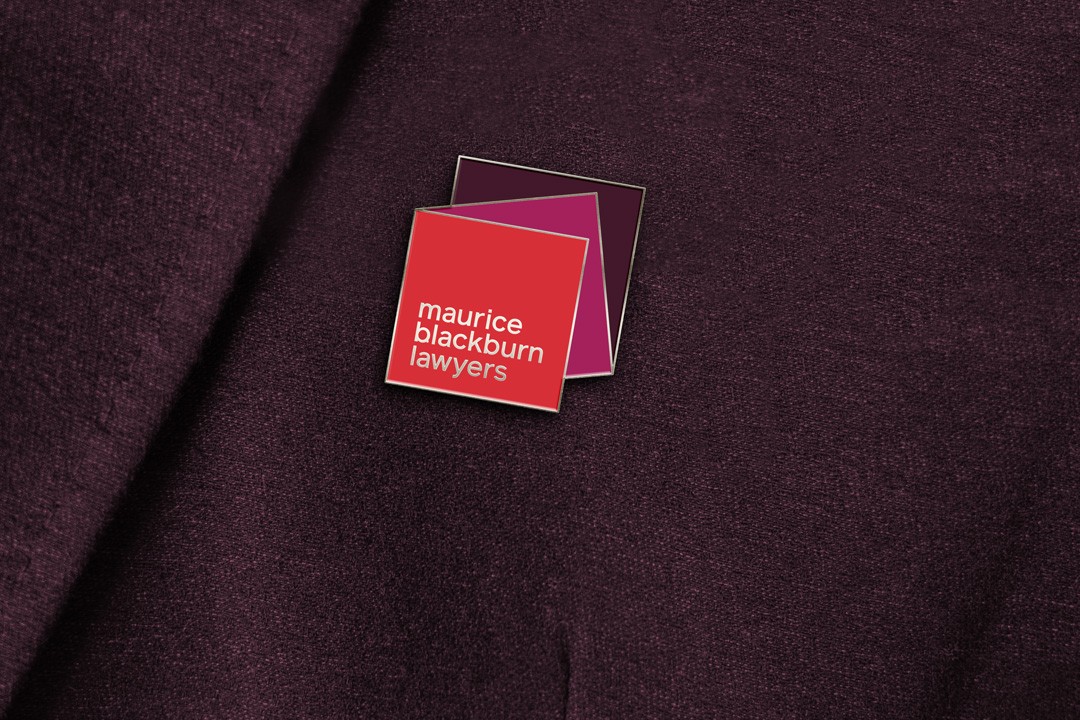
Enamel lapel pin of the layered square logo, pinned to plum wool fabric
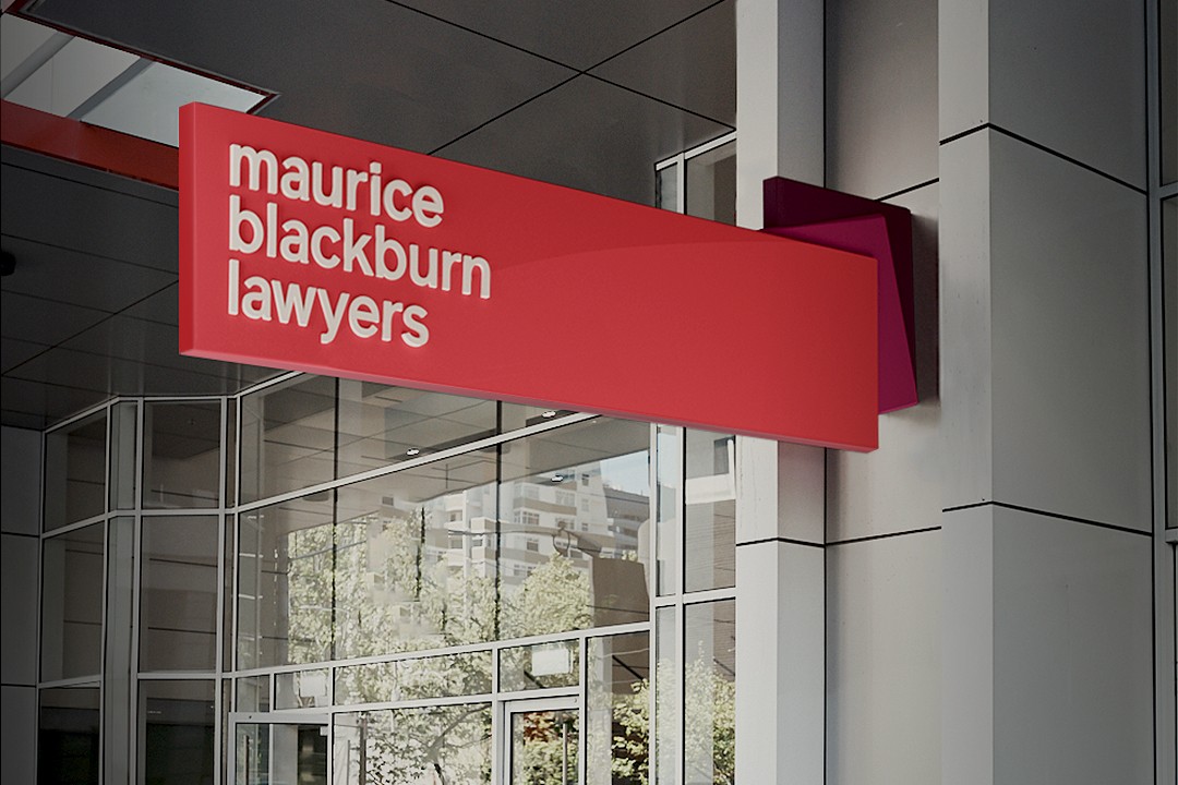
Projecting red blade sign reading 'maurice blackburn lawyers' above a glazed office entrance

We had a terrific partnership with Re, developing the research approach to understand our clients, developing the strategy which was validated with clients, and then delivering what is a truly wonderful strategic brand identity.

Caroline Ruddick, General Manager Marketing, Maurice Blackburn
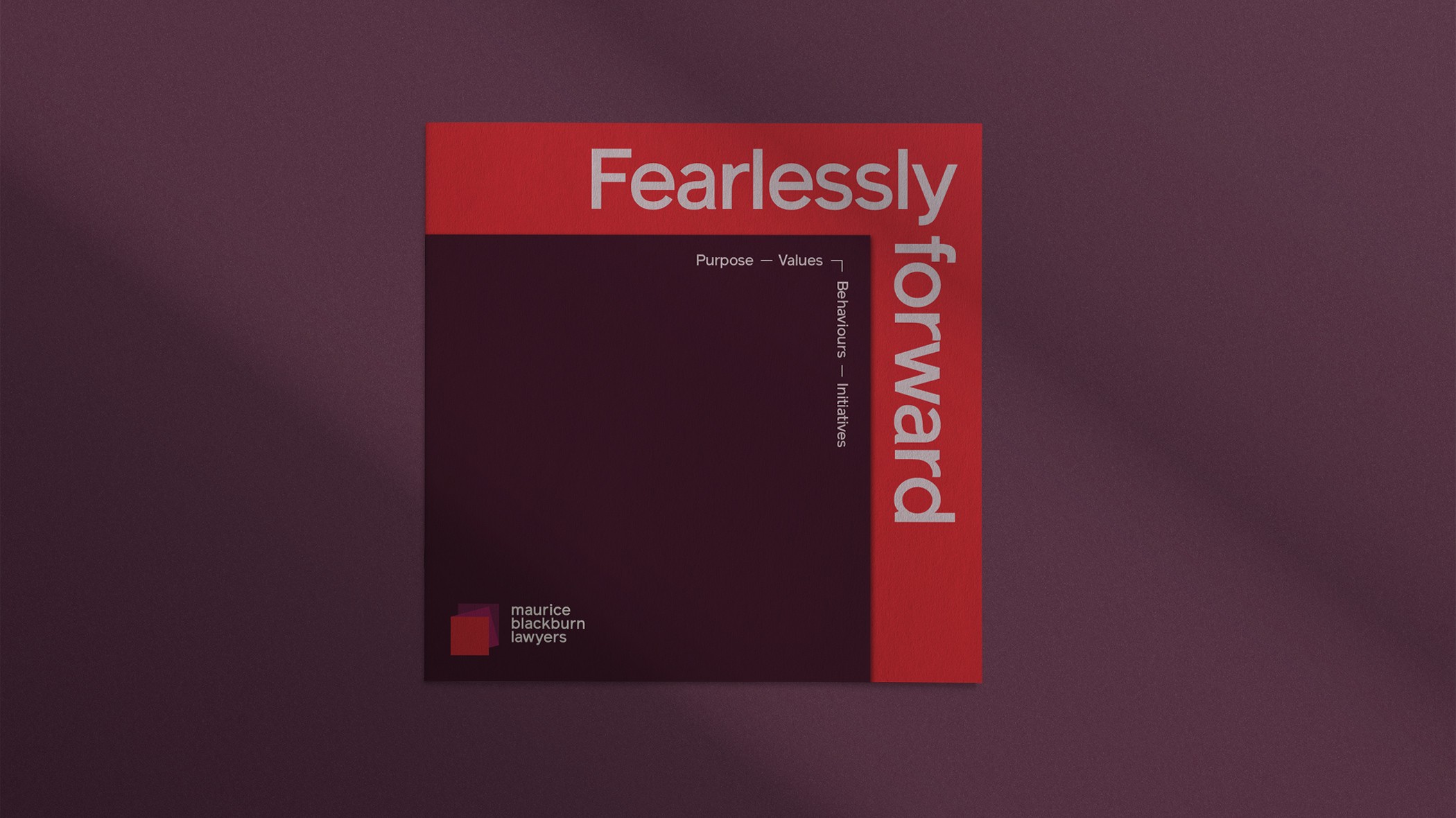
Square booklet cover in deep plum with a red spine band and 'Fearlessly forward' headline
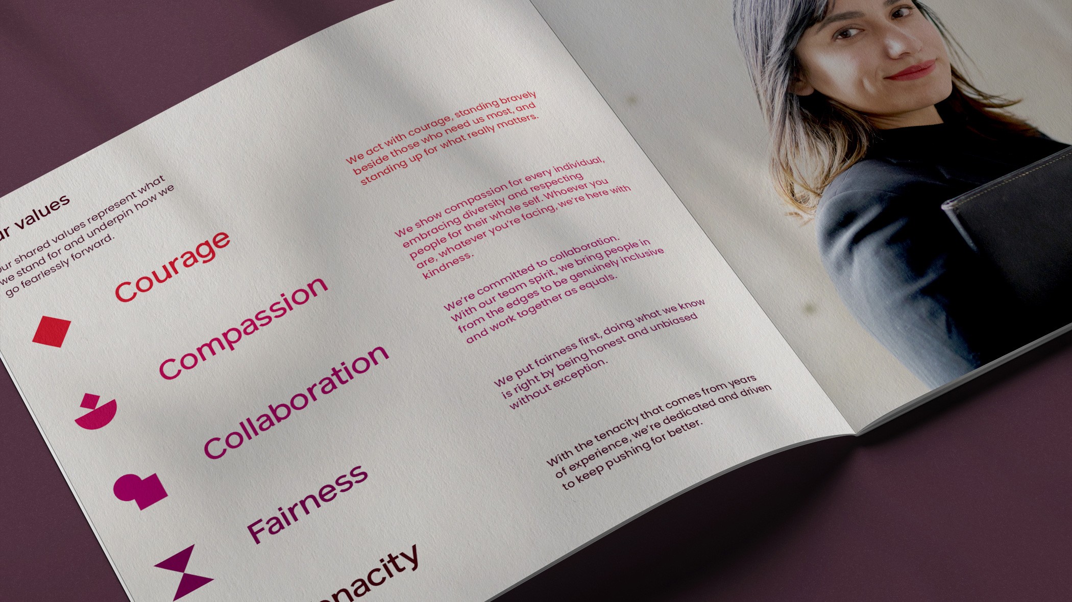
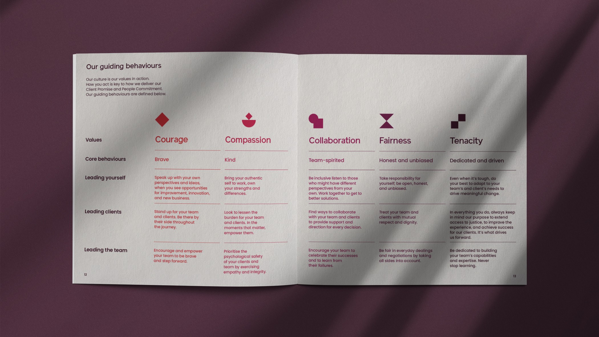
Maurice Blackburn values spread listing Courage, Compassion, Collaboration, Fairness and Tenacity
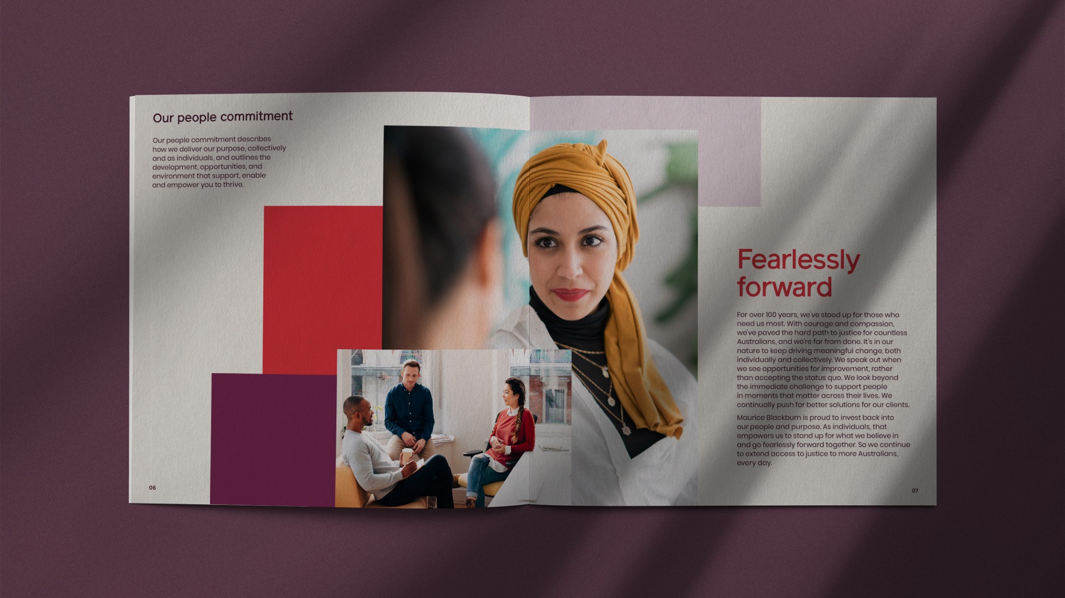
'Fearlessly forward' spread from the Maurice Blackburn people commitment, photos over colour squares
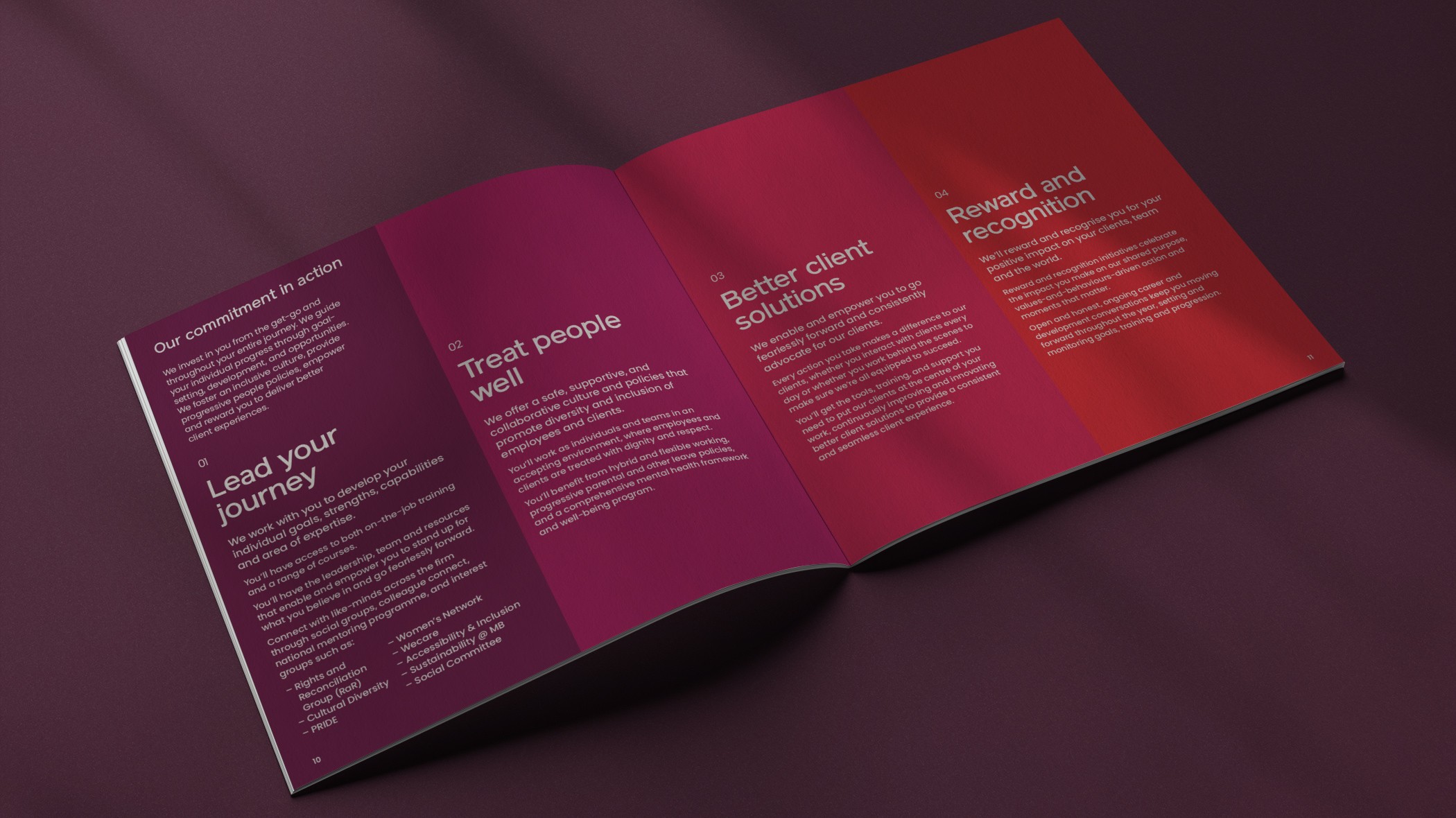
Commitment booklet spread with four colour-blocked panels shifting from magenta through to red
Guiding-behaviours matrix pairing each brand value with its icon and behaviour copy in red and plum
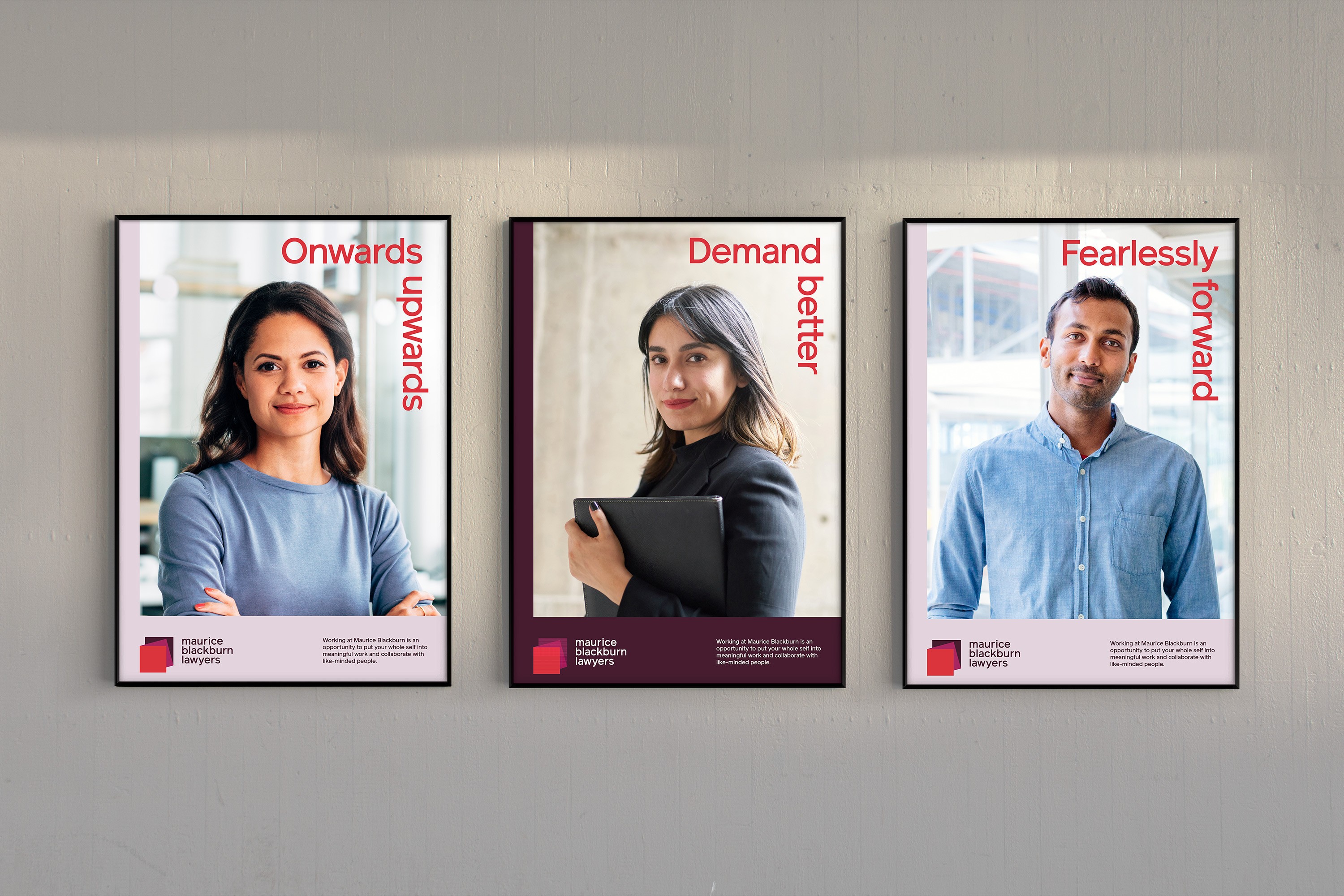
Three framed Maurice Blackburn recruitment posters with staff portraits and vertical red headlines
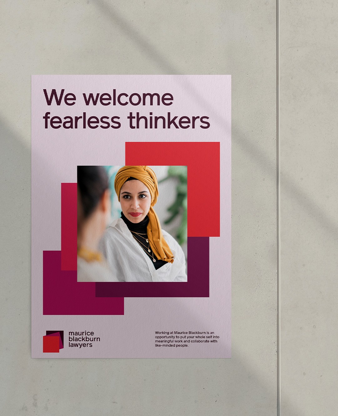
Recruitment poster in pale lilac, 'We welcome fearless thinkers', over stacked red and magenta squares
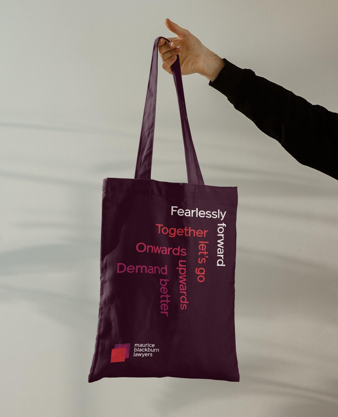
Plum tote bag printed with interlocking brand lines including 'Fearlessly forward' and 'Demand better'

The collaborative process with Re was excellent and enabled us to develop an internal brand that is an authentic reflection of our unique culture.

Simone Hartley-Keane, Chief People & Culture Officer, Maurice Blackburn

More work

Get in touch

hello@re.design
©2026
Level 20, 25 Martin Place Sydney, 2000
The Commons, 10-20 Gwynne St, Cremorne VIC 3121