Our brand is our visual voice, plain and simple. It embodies the character we share with the world. It's the personality we carry with us everywhere we go. As we transitioned from a brand studio to a global design business, we wanted to reflect that in every aspect of our digital design, our experience and our collateral.
This included a typeface that would be used by more than 120 employees around the world. One that would be seen by thousands of people. One that would continue to represent Re to the clients who have earned us our full trophy cabinet: Optus, FIFA, Woolworths, Kenwood, Skyscanner, The Global Fund… to name a few.
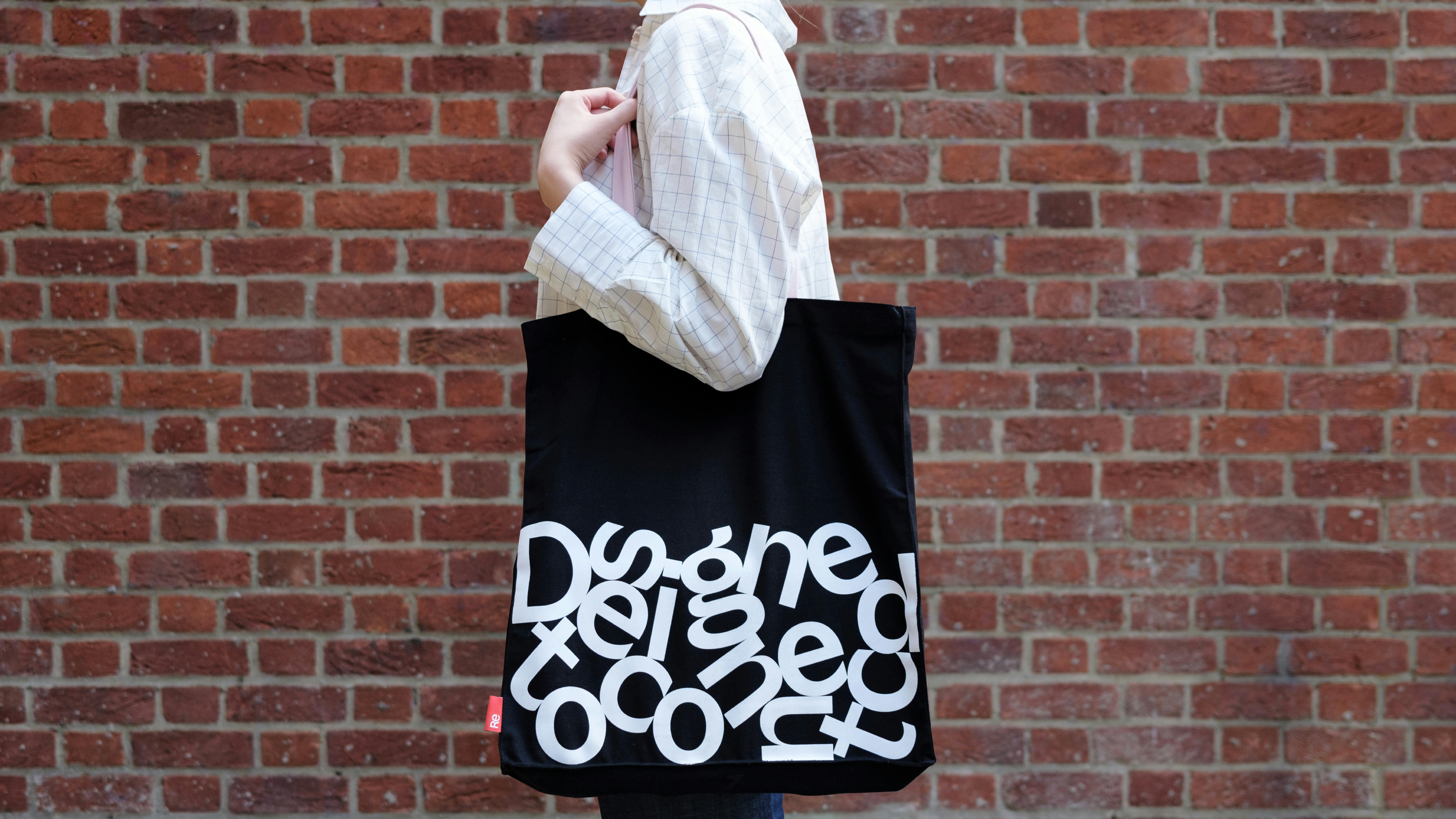
This meant we needed a typeface with as much personality as anyone at our company. Darren Bowles, Partner and Executive Creative Director at Re, said it best:
“When you develop a typeface with some character, you consistently find new moments where it makes you smile.”
The idea for Re Connect was born.