Transforming a heritage company into a cutting-edge software brand

For over two decades, Verint was a leading solutions provider in customer engagement and cyber intelligence. A few years ago they made the decision to spin off the cyber intelligence unit and develop a stand-alone brand for the newly independent company.

By Darren Bowles, Partner and Executive Creative Director - Re

Oct 2021

Share article

URL copied to clipboard

Share Article

This was all about setting a new direction for a new time. Re was selected as the creative partner in developing the new brand, including a new name, visual identity and powerful narrative. All while retaining a very clear respect for Verint’s strong legacy in the market and its long-established reputation. The year-long creative process came to life on February 2, 2021, when Cognyte was publicly traded on Nasdaq for the first time.

In this Q&A, Amit Daniel, Chief Marketing Officer at Cognyte, and Darren Bowles, Partner and Executive Creative Director at Re, share some of the highlights and key learnings from this process.

What made this process different and unique from a regular rebrand?

Amit: Verint comes with a great legacy. So when the strategic decision was made to spin off our business from the parent company, the challenge was how to develop a new name and identity while retaining our strong perception in the market, our 25 years of industry leadership, with a strong and growing ecosystem of 1,000+ customers.

We needed to take the strong legacy brand and run a successful process that both retained our reputation while also differentiating us from the previous brand and our competitors. It was really important to capture our evolving narrative in a simple, memorable and easy-to-execute way. This is what led our thinking when choosing our partners, when deciding on the name, and when defining the visual and verbal narrative.

Where do you start when coming up with a creative idea for such an intricate process?

Darren: A powerful and simple creative idea sits at the heart of all the most loved and respected brands, whether you’re talking about Coca-Cola, Google or IBM. At Re, our approach is to always start from the authentic DNA of the business we’re working with. We consider its perception in the market, its value to customers, its internal culture – and build something magical from these core ingredients.

We knew from the out-set that this public listing was hugely anticipated in the security analytics world. Therefore the new brand needed to be highly dynamic, and capture the excitement and agility of Cognyte’s technology and future without losing the strong foundations of its 25-year industry experience.

There are so many aspects to the Cognyte brand. How did you make sure it all tied together and looked like part of one coherent system?

Amit: To understand our new look and feel, it’s important to understand what Cognyte does. Our open software fuses, analyzes, and visualizes disparate data sets at scale to help security organizations find the needles in the haystacks. This story needed to be told clearly and coherently through our new brand identity.

Our new visual language needed to demonstrate the connection of these different data sets, and show how we generate insights and provide actionable intelligence, literally connecting dots and creating actionable intelligence for our customers and partners. Landing a coherent story was key to our success, as the brand had to be implemented rapidly across all channels, touchpoints and internal and external communication in time for the spinoff!

We started our process with naming. It was important that while they were moving away from the previous name, we needed to keep the sense of strength, trust and legacy. Re took us through a rigorous naming process that landed us on Cognyte, a name that brings together 'cog' from 'cognition' and 'nyte' from ignite. The name speaks to our advanced analytics capabilities as well as the bias for action and igniting security investigations for a safer world. It is a new word that has associations with complex thinking, feeling both technology-led and dynamic.

A key insight that we emphasized throughout was that our broad offering and technologies were entirely unique in our market: ours is the only true pure play security analytics player across all security domains and challenges. This needed to be reflected in our look and feel.

Darren: …All of this combined led us to our defining creative idea: ‘reaching wide and diving deep’. This idea encapsulated the brand’s holistic power in security analytics, and allowed us to tell a sophisticated story in a simple way.

We chose different shapes to demonstrate variety, depth and visual richness, and also show the multiple forms of data that Cognyte handles. You’ll see that the graphic language consists of a lot of geometric shapes used in different combinations: this was our solution to telling sophisticated data stories in an abstract way. The linear unfolding mimics the software in action.

We also introduced angles in the core brand DNA. The logo reinforces the same story of cognitive connections and insights: each letterform has a clean point of connection, as a metaphor for how Cognyte’s technologies work and the value they unlock.

Beyond the logo and graphic language, we took a bold approach to color that reinforced Cognyte’s progressive DNA. We selected the futuristic freshness of a ‘proactive purple,’ which we combined with the solidity of a ‘deep purple.’ This combination captures the tension between being cutting edge and mature at the same time, a force that sits at the heart of the business and makes Cognyte so unique. 

These elements came together to form a coherent brand that told the unique Cognyte story effectively and engaged new and existing audiences well.

Amit: Once we nailed the name, color, and look and feel, we needed motion and art direction to breathe life into our brand.

To represent the context of the insights that our technology solutions deliver, we selected images that tell a story and represent familiar scenarios in the security analytics world.

To show software and technology, we use abstract representations, with a focus on light, patterns, and architecture. 

And we made a concerted effort to include as many people as possible in our photography. After all, our strength comes from the amazing people at Cognyte, who are the driving force behind our cutting-edge technology and literally our ‘secret sauce’. We needed to ensure that externally and internally, the people and technology were seen in tandem to highlight these two pillars of our strong employer brand that needed to be carried over with us.  

How did you manage to adapt your process when the pandemic hit?

Amit: The pandemic certainly affected the way we worked. Our plans were to meet in person throughout the year and do intense workshops to drive progress quickly. Our kickoff meeting took place face-to-face, shortly before the pandemic grounded us all. This allowed us to set the foundations for the rest of the process, and we established a relationship that was open, direct, and personal – this helped as we transitioned to more remote ways of working.

Darren: It was a shame we weren’t able to work in person more, but both teams adapted very quickly to remote working. We were able to continue a close and honest relationship with Amit and her team, and in some instances technology actually made us more agile and collaborative. So in a way it really helped push the work further!

How did the pandemic context impact the brand work?

Darren: In some ways it did, but in other ways we would have developed the brand as it is regardless of the pandemic. For example we were always aiming to develop a digital ready brand that really comes alive in print, web and in motion. This was perfectly aligned for a software company.

Where the pandemic did impact our brand work was on the cultural side. During the pandemic everyone became aware of the increased importance of feeling part of something bigger, now that we were isolated. This was more critical now than ever before. To address this, we developed a strong internal brand that colleagues could be proud of. We made sure our people were front and centre, our softer pastel colours were now primary palette. Overall, our goal was to make the internal brand more fun and expressive for internal staff.

And let’s be honest, no creative process is perfect. What were some of the biggest challenges for your team?

Darren: Challenges are a must in any creative process: without them there’s no creative tension and the work ultimately falls short. For us, the biggest challenge – which turned out to be a big opportunity – was ensuring this brand was coherent and logical, that all the elements tied perfectly together, within a very short timeframe. Throughout the project we were running multiple workstreams in parallel, which comes with its own challenges in terms of revisiting elements many times, iterating on many versions, and working in a constant state of ‘WIP’. We had a lot of close contact and communication with the internal teams at Cognyte who went through it all with us. Ultimately this agile work style led to great work that was totally bought into by our colleagues internally as well as our team, and it created a very strong sense of camaraderie!

There were other small challenges too, some being side effects of COVID. Because this was a digital-first rebrand, we intended the identity to always be moving and coming to life in the applications. However, even simple animations are not easily seen when people are all over the world. This meant we had to really lean into the motion behaviours and create living brand that would create big impact even on small screens.

Amit: Because of the tight timeline we really had to cross this bridge while building it! For example, we couldn’t finalize the narrative before developing the visuals, so more than once we found ourselves revisiting the visuals as the new company narrative evolved.

We also didn’t predict the challenges we’d meet as the visual identity met different channels and media. What worked beautifully on documentation and presentations often required very different treatment on digital channels, and even more so with video. We learned that the brand would continue to evolve long after the initial direction was chosen.

As we know, this is a relationship business. What makes for the strongest creative partnerships between creative teams and their clients?

Darren: We pride ourselves on developing strong relationships with our clients - it’s all about the people at the end of the day. Good people want to work with good people. For us this often comes back to two simple concepts: communication and trust.

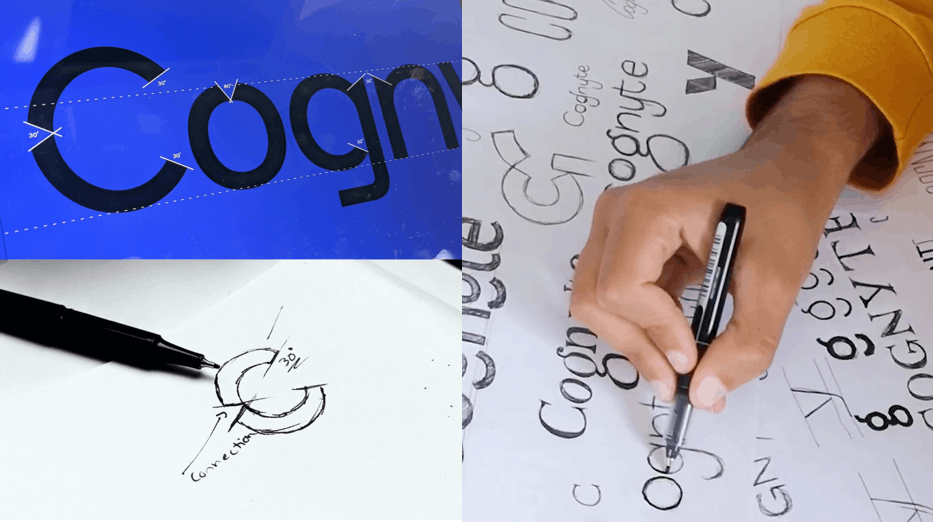
No matter who you’re working with, it’s always critical to establish strong feedback loops from the beginning. This gives both sides a channel to discuss the work frequently, and allows everyone to be agile and to course-correct sooner rather than later. Communicating and collaborating with internal design teams is also part of this, it helps everyone feel ownership over the work and more connected to the end product. We kept very close to all teams, going back and forth and really stress-testing everything from naming, to messaging to digital component design to imagery style.

Second, trust! This goes both ways, and it’s so important to a true partnership to be able to trust each other and have those very honest conversations. It makes the process easier and more enjoyable, which always leads to the best creative work.

Amit: Trust is certainly a key here, but that was also earned along the way. Ultimately, the result of our joint work was stunning. We saw great collaboration between the in-house design team, the Re team, and the various vendors we brought on to support the project.

It was also critical that we keep all teams on both sides fully involved all the way through, from strategy to post-execution. We worked on it all together – communication, messaging, product marketing, design – all teams contributed and shared feedback. We had some heated but respectful professional debates, and the outcomes often led to new insights and beautiful results.

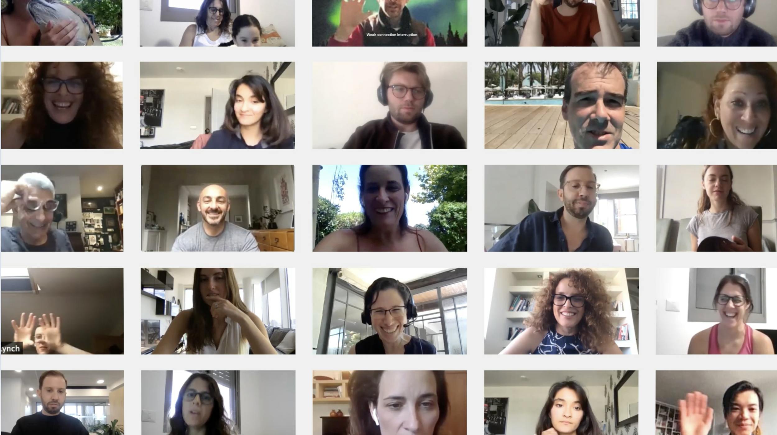
Communication was also key as we rolled out the brand. We made clear communication channels for all the design teams during the rollout, and worked together to bring the employees on board when the time came to reveal the brand.

Is your work done?

Amit: No, our work is not done. But we have made great progress and I am proud to see our brand immersed in every corner of our physical space, as well as on social media, and across digital channels.

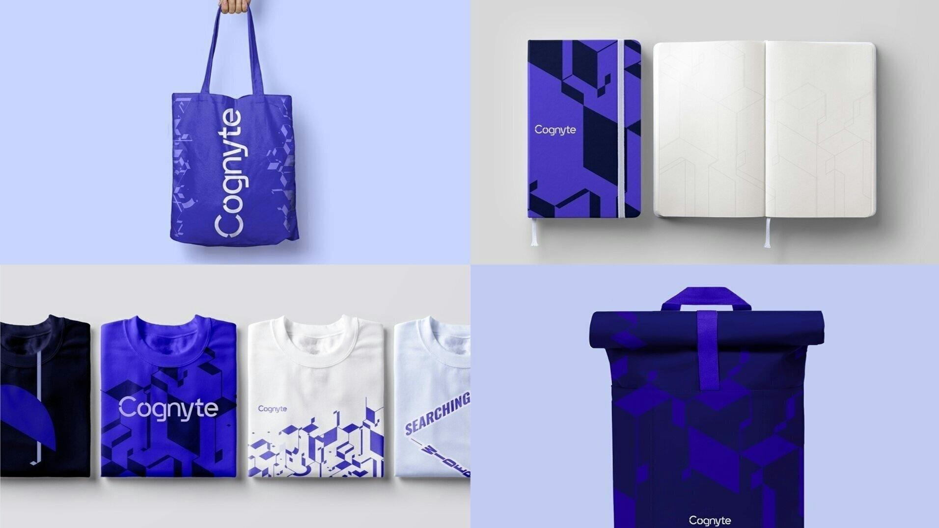
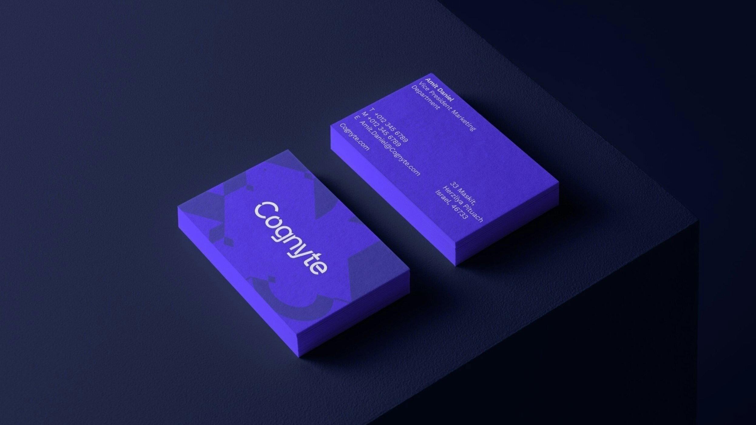
It is now a little over a year since this process began. And we have achieved many accomplishments with the new brand. We have literally surrounded ourselves with it, ‘Cognytizing’ our offices, our collateral, and our products. It was fascinating to see how quickly our employees identified with the new name and began to use it naturally.

However, a brand is not something that one ever ‘completes.’ It is something that evolves together with the organization, and improves as we learn what works, what drives our business goals, and even what is less effective.

You can see this exciting development on our social networks – on LinkedIn, Facebook, Twitter, and YouTube. To see it visit the Cognyte website and follow Cognyte on social media to see how the brand and visuals continue to evolve.

Designing an identity that says: This is Sydney

When Olivia Ansell, the incoming Sydney Festival director, expressed her vision to us it was for a bold and vibrant festival identity that captures the coming-out-of-lockdown summer that Sydney deserves.

By Shannon Bell, Creative Director - Re

Nov 2021