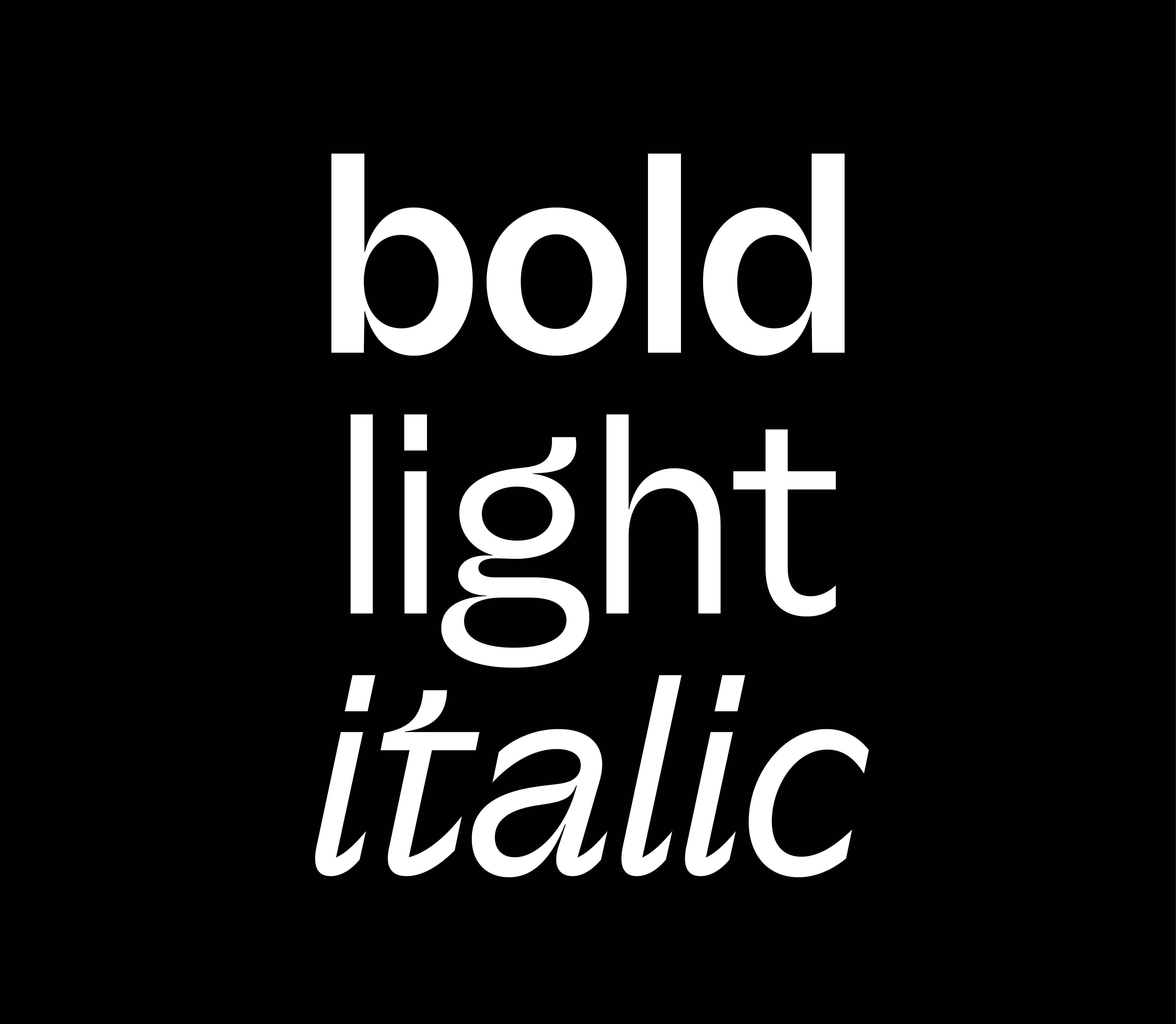
A typeface to connect

A company’s appearance? It’s more than just surface-deep… it’s everything to its clients, customers and peers. We all judge books by their covers first, and a design company is especially vulnerable to blog critique if it doesn’t look and feel like just the thing.

Apr 2022

Share article

URL copied to clipboard

Share Article

Our brand is our visual voice, plain and simple. It embodies the character we share with the world. It's the personality we carry with us everywhere we go. As we transitioned from a brand studio to a global design business, we wanted to reflect that in every aspect of our digital design, our experience and our collateral.

This included a typeface that would be used by more than 120 employees around the world. One that would be seen by thousands of people. One that would continue to represent Re to the clients who have earned us our full trophy cabinet: Optus, FIFA, Woolworths, Kenwood, Skyscanner, The Global Fund… to name a few.

This meant we needed a typeface with as much personality as anyone at our company. Darren Bowles, Partner and Executive Creative Director at Re, said it best:

“When you develop a typeface with some character, you consistently find new moments where it makes you smile.”

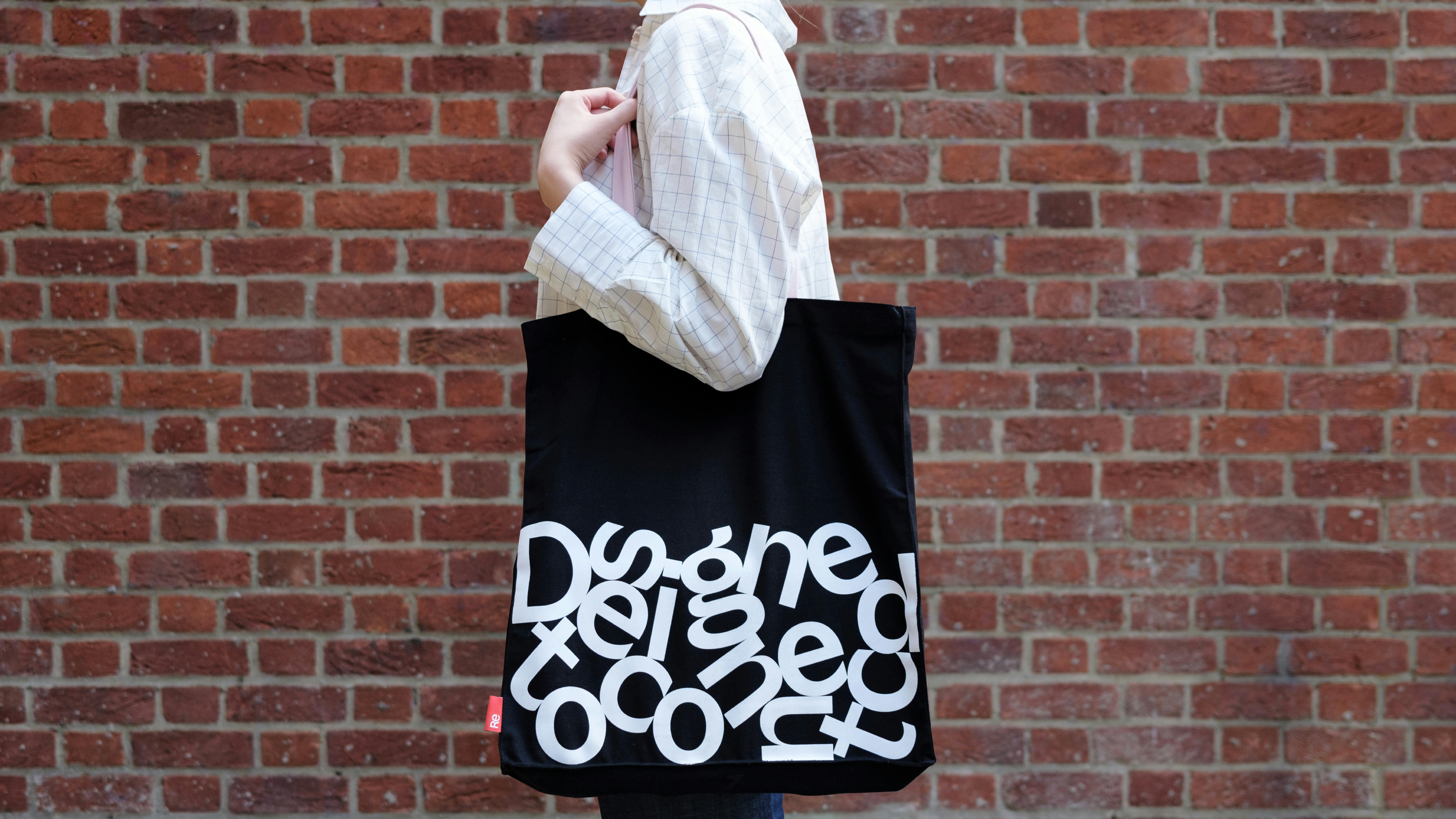
The idea for Re Connect was born.
Old Ethic, New Look

A builder’s house is never finished. No one knows that better than us and as Churchill said, perfection is the enemy of progress. We practise what we preach and we wanted a brand that represents creative spirit, craft, integrity, digital nativeness and all-around holistic design.

This is especially true of our new typeface. We like to think of it as a signature, an investment, something that helps us stand out in a creative sea of sensible sameness.

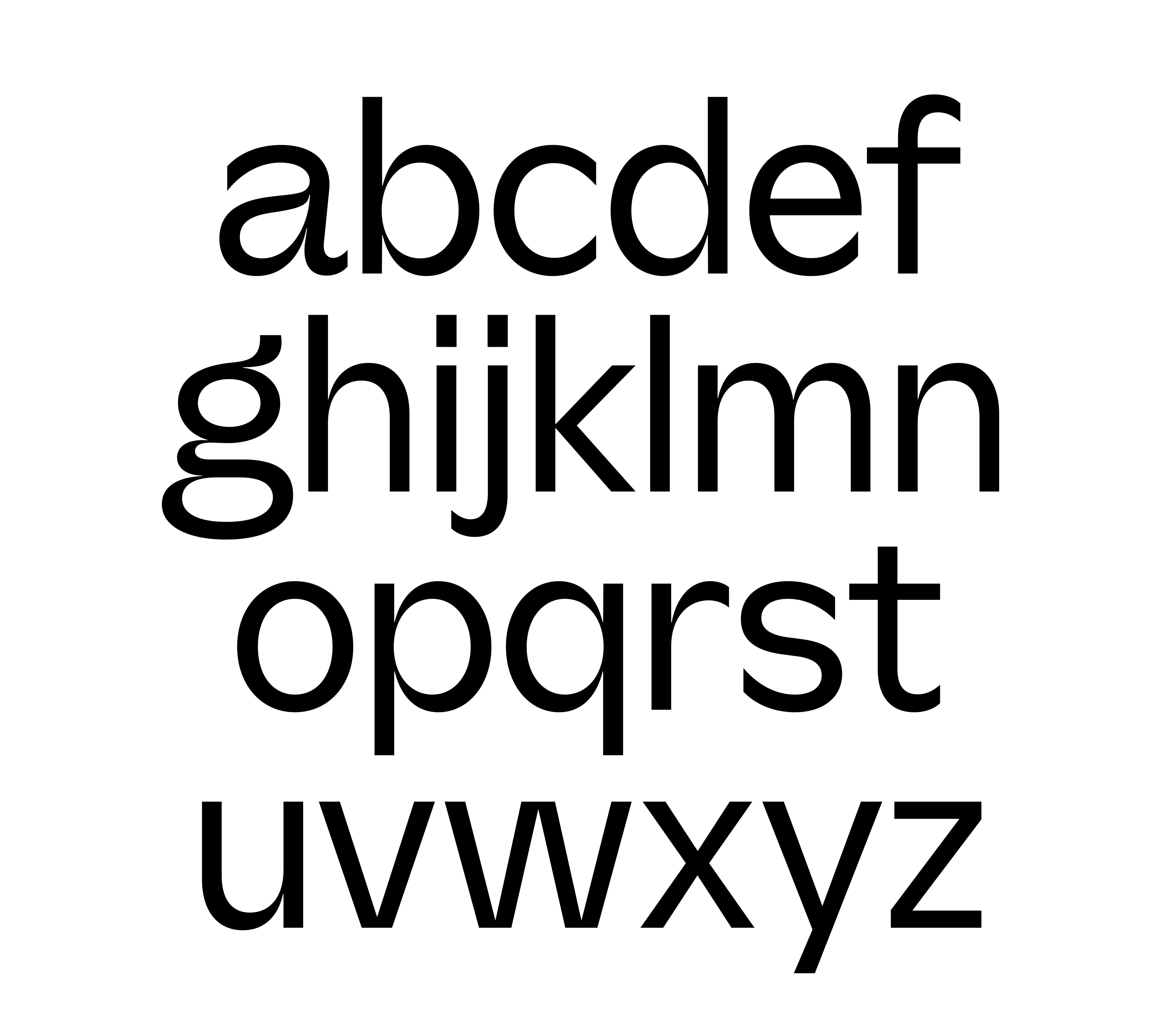
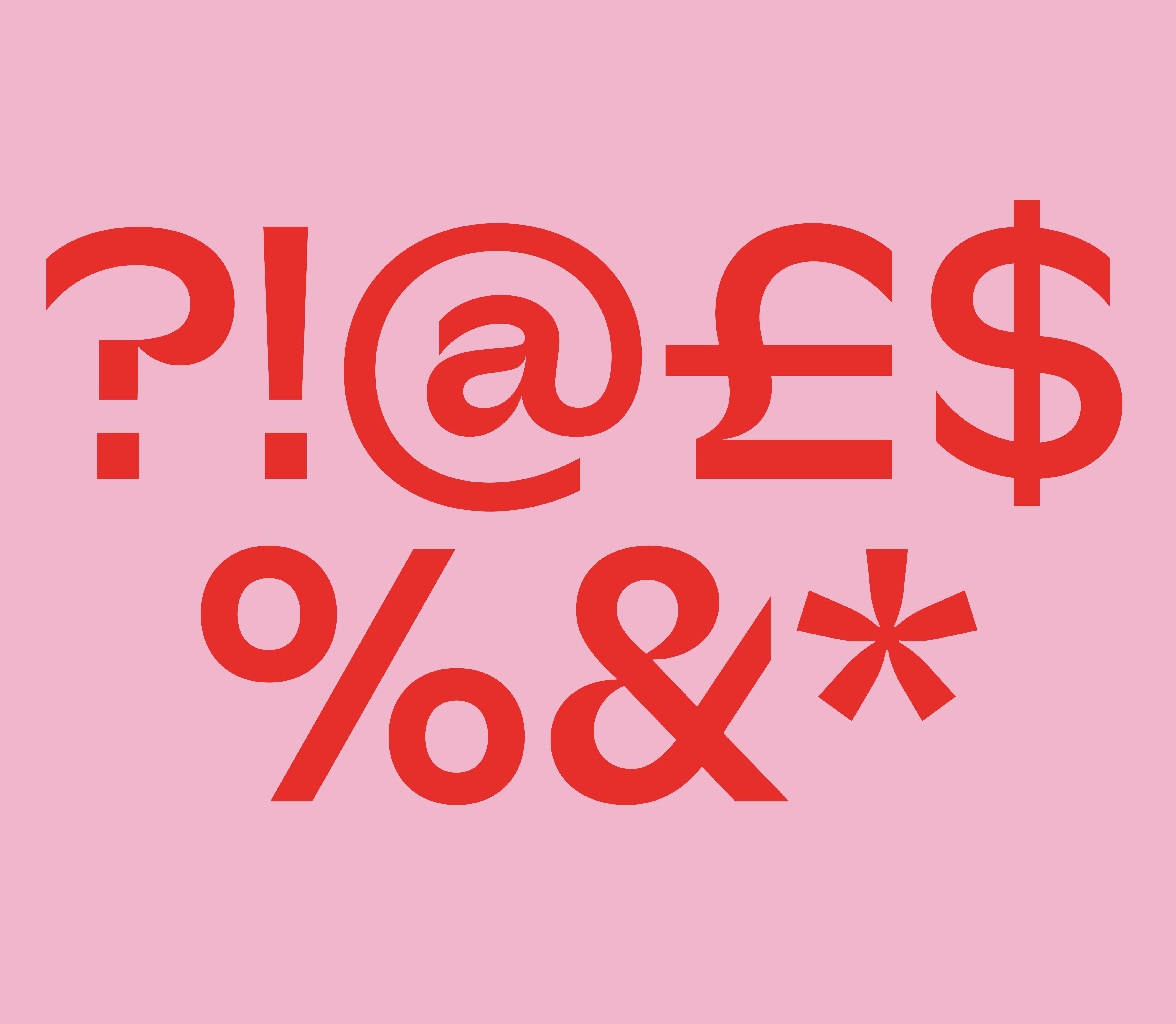
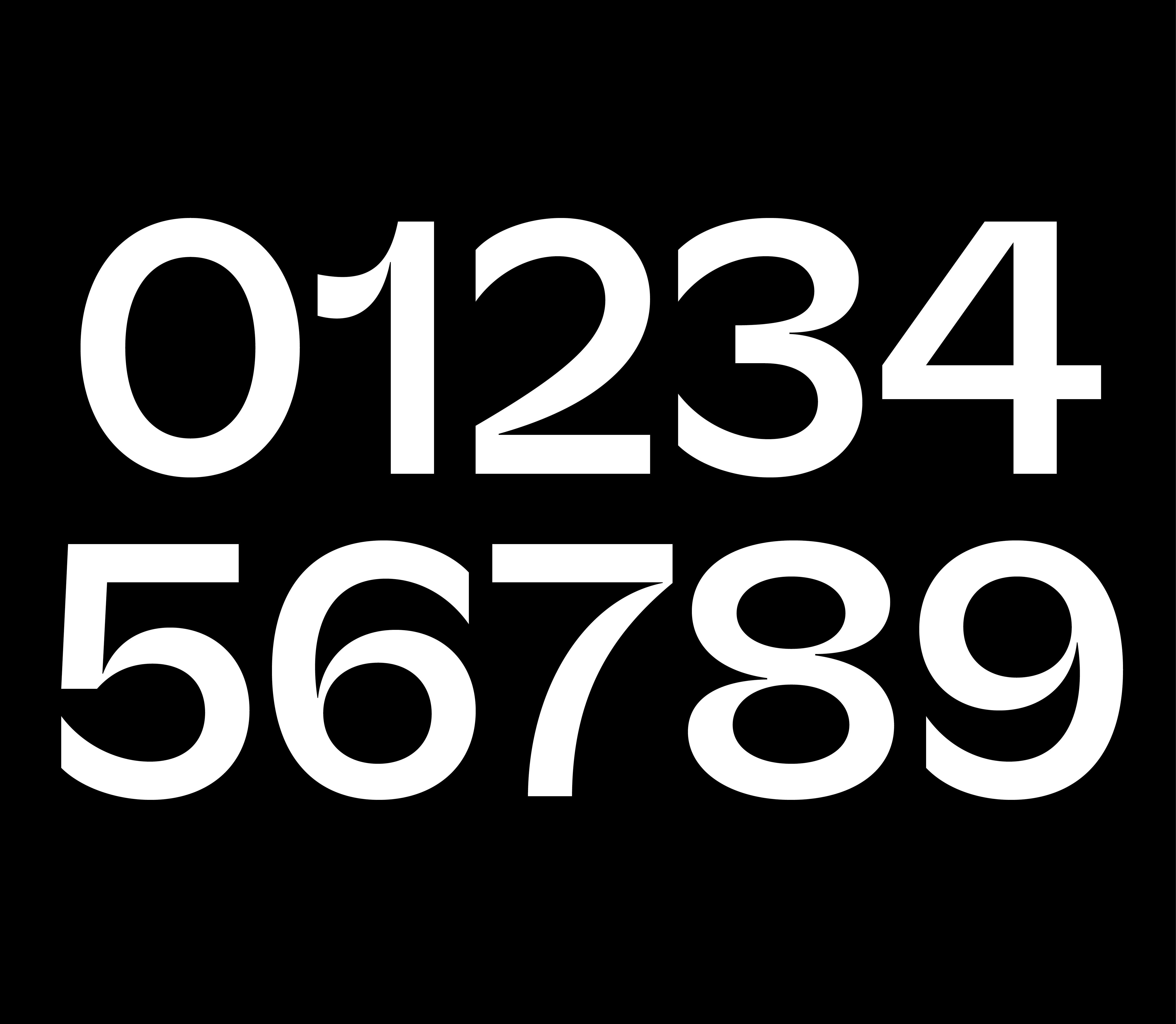
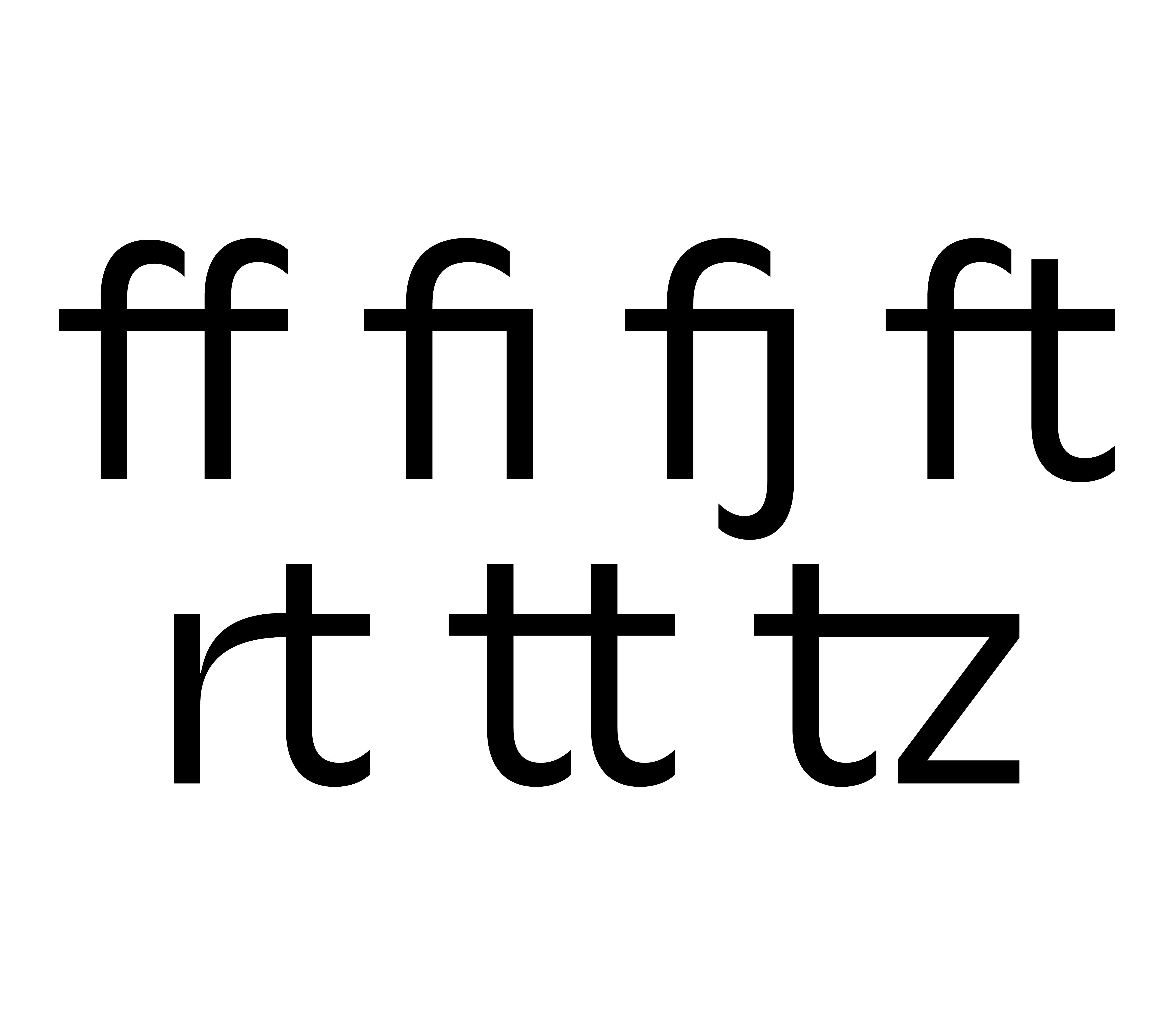
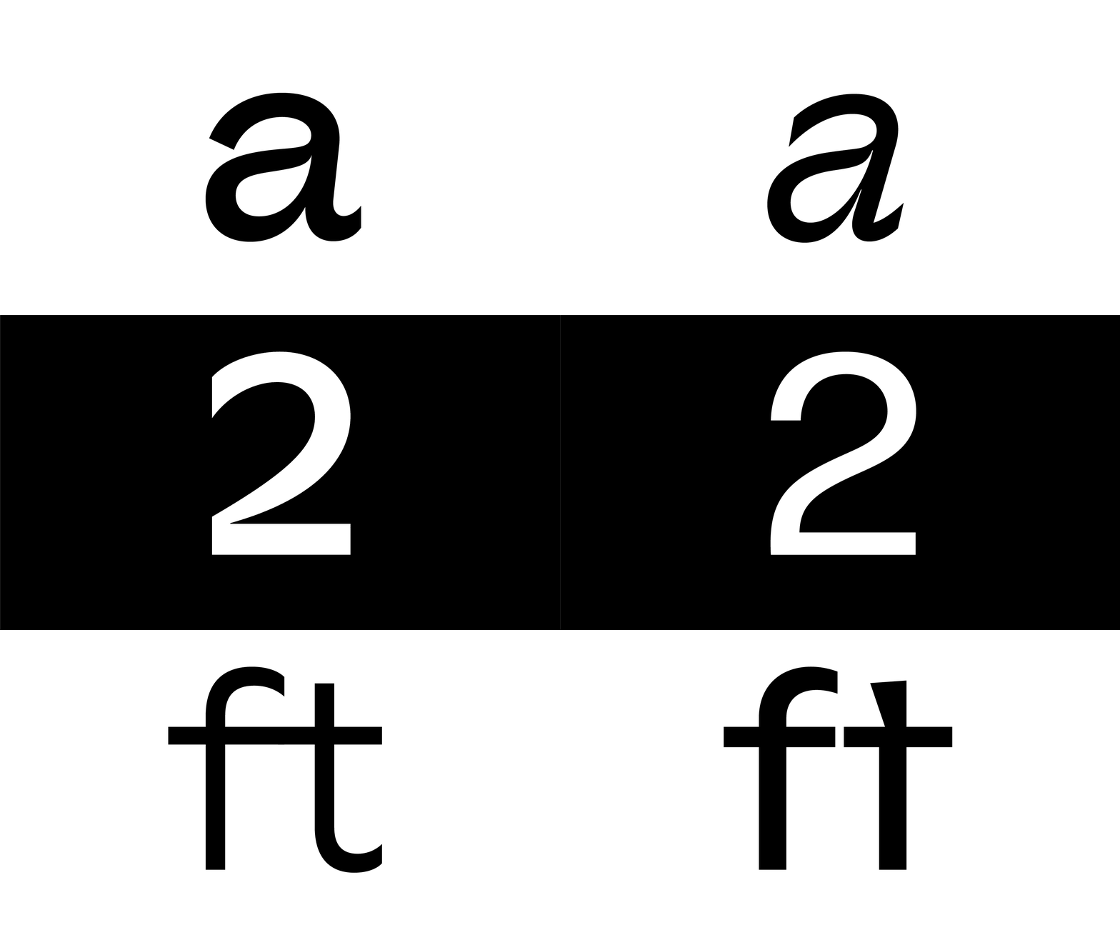
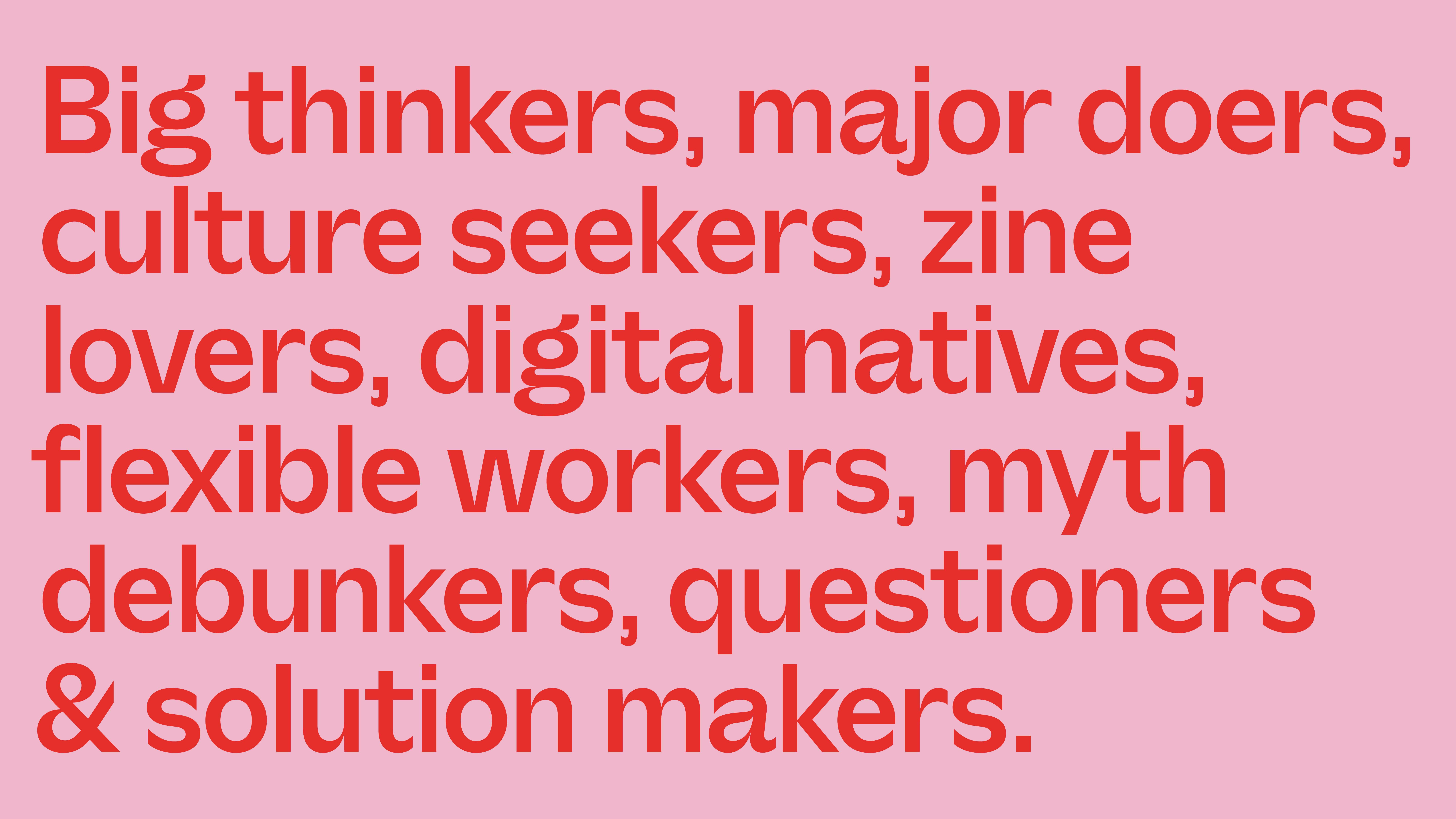
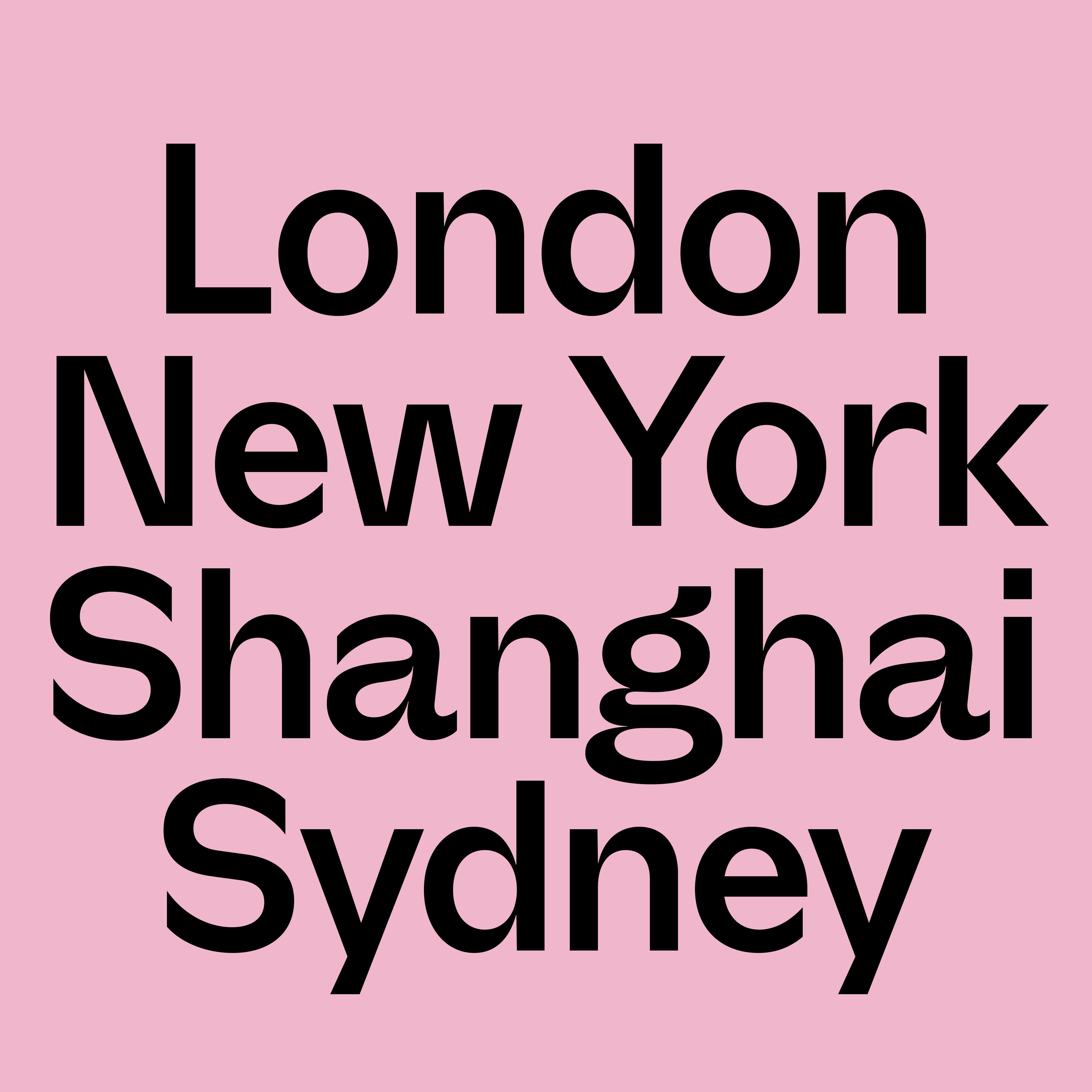
To do this with authentic Re character, we opted for vertically-sheared terminals, strokes that extend out to either side, drawing implied connections and creating a feeling of flow throughout the text. Letters that are sharp and stylish, yet quirky and cool. A font that can breeze along or stack up flush in tight ‘magnetized’ connected layouts.

Our new typeface contrasts clearly with our last one, which was a utilitarian and minimalist affair. It draws people in, it makes things approachable, warm – and yeah, human.

A Worthy Investment

As many a client might ask, “With a world of great typefaces out there, lots of them free, why did you design Re Connect yourselves?” But just as with logos, photography and great product builds, a good font is worth investing in, and to that end, ours was made by the very best creative talent. We reached out to Lewis MacDonald from Polytype, a previous collaborator whose passionate assistance and deep well of knowledge is reflected in every stroke.

Our stunning original typeface is very much thanks to him, so we asked him to share a little bit about what went into its creation and design.

Q: What’s your background and where are you from?

A: I’m an independent, self-taught type designer based in Glasgow. I run Polytype, a one-man type foundry. I produce original, characterful typefaces for retail and custom type clients, with an emphasis on combining technical quality with a sense of humour.

Q: What’s your favourite way to work?

A: I enjoy indulging in an unstructured, free approach in my self-initiated projects. Taking a single doodled glyph that excites me as a starting point, I’ll haphazardly flesh out the rest of the alphabet around it, seeing where the process takes me. It can be liberating to work in this way – without any set goals – and it can lead you in interesting, unexpected directions.

Q: What was the concept behind the typeface Re Connect?

A: The goal with Re Connect was to create a typeface that embodied the company’s ‘design to connect’ proposition in a beautiful and sophisticated way without grabbing too much attention.

Together, we developed a static style that is infused with a feeling of connectivity and flow. Words feel strung together with an invisible sinuous horizontal thread. Employing emphasis by subtraction, the glyphs have been drawn with sharply tapering stroke joins, drawing the eye to the connections in their construction.

A: From the early concept explorations to the final exported files, everything was drawn in the font editor Glyphs. This versatile software enables the user to easily manipulate vectors for typeface design, both as single letters and in the context of whole words. It was instrumental to meeting Re’s vision for a dynamic typeface with motion at its heart.

Rachel Dawson from Re says, “Alongside Lewis, we investigated different ways of showing connectivity in type, both in the structure of individual glyphs and their relationship to one other. Something we really liked from the beginning was the idea of ligatures or terminals of characters that flowed from one to another to help show the idea of connection, which would also lend itself well to being animated.

We worked entirely remotely for the duration of the development process sending references, sketches, font files and applications back and forth until the DNA of the typeface felt intrinsically Re.”

Q: Where do you think the typeface is most successful?

A: The goal was to develop a beautiful typeface with a character that leaned heavily towards sophistication, but with a subtle, reserved edge of cool. I think Re Connect manages to strike that balance very well.

At Re, We Design to Connect

Good design has the ability to link hearts to minds, problems to solutions, and people to products and experiences. Just as each letter in our typeface moves organically toward the next, so we strive to bridge businesses and people – and to connect people to one another.

To give our brand substance, it starts behaviorally with the design of a connected company, from C-Suite to studio floor. We believe our success is measured in every interaction, every experience and every word. 

We hope that the future words we put into the world do justice to such a beautiful and authentic typeface. She looks great, and we hope we wear her well.

The HealthTech Brand Check: Part 1

Part 1: The dynamics shaping the future of healthcare businesses. The Coronavirus pandemic has, through necessity, only accelerated the pace of digitalisation in the healthcare industry. The scale of this opportunity, combined with rapid technological advances and fast-changing expectations among consumers, patients and doctors, means that competition will be fierce. HealthTech businesses will need a powerful, differentiated proposition, a strong brand, and an exceptionally good user experience if they are to succeed.

Apr 2022